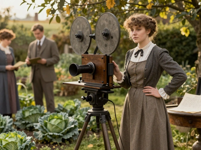
When you watch a movie set in the 1920s and the characters sip martinis in a room with perfectly worn leather sofas and brass doorknobs that look like they’ve been touched by a hundred hands, you’re not just seeing a set-you’re seeing years of research. But what if that same movie throws in a neon-lit jazz club with a modern synth score and a protagonist wearing a suit that never existed in 1927? Is that a mistake… or genius?
Why Period Research Matters More Than You Think
Production design isn’t about decoration. It’s about building a world that feels real, even when it’s entirely fake. A single misplaced object can break immersion. A 1980s-style alarm clock in a 1945 bedroom? That’s not a typo-it’s a distraction. Audiences don’t always notice when something’s wrong, but they feel it. That unease sticks. It’s why filmmakers hire historians, archivists, and even antique dealers to work alongside set decorators.
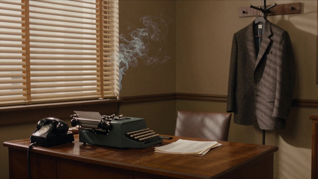
Take Mad Men. The show’s production team spent months tracking down original 1960s wallpaper patterns, matching the exact shade of mustard yellow used in American kitchens. They even sourced real rotary phones from eBay and restored them. Why? Because the show wasn’t just about fashion-it was about the texture of daily life. The weight of a typewriter, the smell of cigarette smoke clinging to wool suits, the way light fell through venetian blinds in a Manhattan office-all of it built a psychological truth.
The Myth of Perfect Accuracy
Here’s the uncomfortable truth: no period film can be 100% accurate. Even if you had every detail right, modern audiences wouldn’t believe it. Why? Because our idea of the past is shaped by movies, not archives.
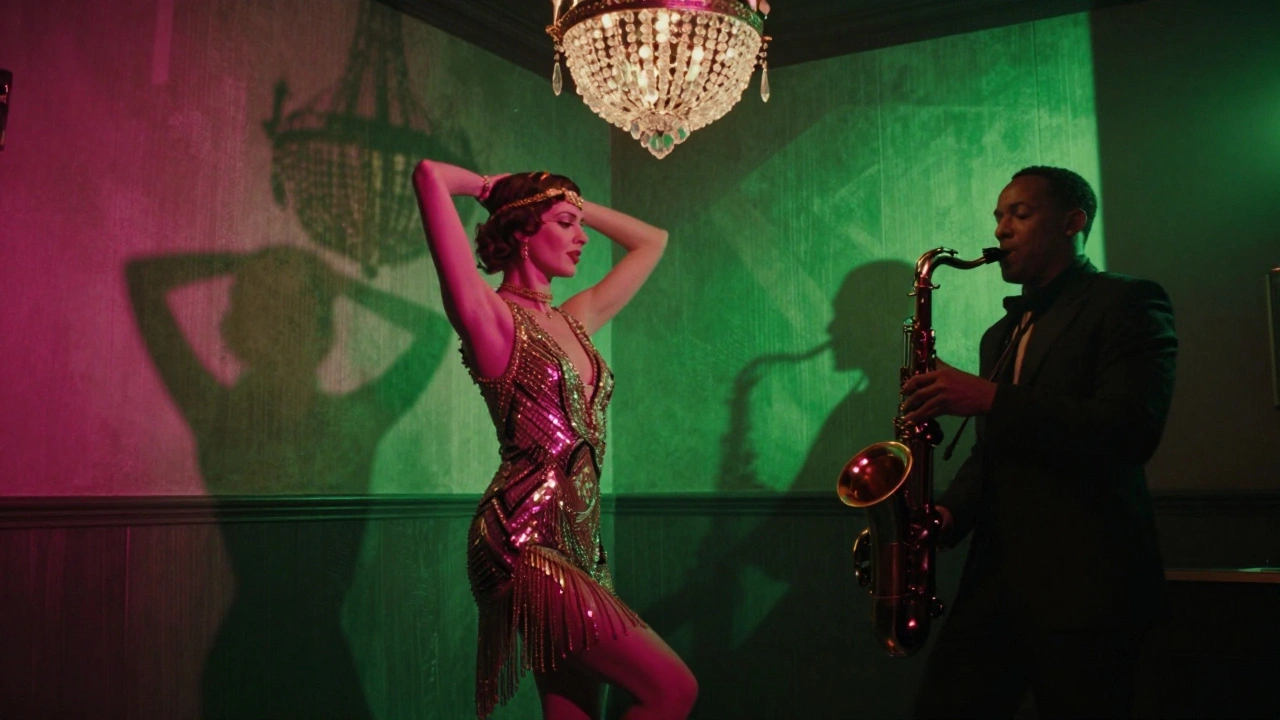
Think about The Great Gatsby (2013). The costumes? Gorgeous. The flapper dresses? Sparkly, short, and impossibly glamorous. But in reality, most women in 1922 wore longer hemlines, heavier fabrics, and muted colors. The film’s version was a fantasy-crafted to match the novel’s tone and Baz Luhrmann’s visual style. It wasn’t wrong. It was intentional.
Accuracy isn’t about copying history. It’s about respecting its logic. If you’re making a film about Victorian London, you don’t need to replicate every stitch of every coat. But you do need to understand how people moved, what they carried, how they sat, how they breathed. A character in a corset can’t slump on a couch like they’re on a modern sofa. Their posture changes everything.
When Stylization Becomes Storytelling
Some films don’t just borrow from history-they rewrite it. Amélie (2001) set its story in 1990s Montmartre but used colors like candy floss and lighting that looked like a dream. The streets were cleaner, the shops brighter, the people more colorful than real life. Was it inaccurate? Yes. Was it truthful? Absolutely. It reflected the emotional world of its protagonist, not the city’s geography.
Same goes for Black Panther. Wakanda isn’t a real place, but its design drew from real African cultures-Zulu beadwork, Maasai architecture, Ethiopian churches. The film didn’t copy any single culture. It synthesized them into something new. That’s not laziness. It’s cultural storytelling. The audience didn’t question whether Wakanda existed-they believed it could.
Stylization works when it serves the story. A period film about a revolutionary artist? Maybe the set should be slightly off-kilter, with crooked paintings and mismatched furniture. A thriller set in 1970s Washington? Gray tones, dim lighting, and real Nixon-era furniture can make the paranoia feel heavier.
The Balance: Research as a Foundation, Not a Cage
The best period designs start with deep research and end with bold choices. You can’t stylize what you don’t understand. That’s why top designers keep research libraries: fabric swatches, photo archives, handwritten letters, even old grocery lists.
For The Shape of Water, the production team studied 1960s government buildings, plumbing systems, and even the way light reflected off wet tiles. But then they added underwater blues, surreal lighting, and a bathtub that glowed like a portal. The research made the fantasy feel real. Without it, the film would’ve felt like a cartoon.
Here’s a rule of thumb: For every one stylized element, there should be ten accurate ones. That ratio keeps the audience grounded. If 90% of the world feels real, they’ll accept the 10% that’s exaggerated.
What Goes Wrong When Research Is Skipped
Bad period design doesn’t come from bad taste. It comes from ignorance.
Remember Valerian and the City of a Thousand Planets? It had futuristic tech, but in one scene, a character used a 2010s-era iPhone. No one noticed until fans pointed it out. That’s not a creative choice-it’s a lapse. It’s like putting a smartphone in a Civil War battle scene. It breaks the spell.
Or consider Outlaw King (2018). Critics praised its gritty realism, but historians noted that the armor was too modern, the helmets too polished, and the kilts worn by Scottish warriors were anachronistic. The film tried for realism but used Hollywood shorthand. The result? A world that looked like a theme park version of history.
When designers skip research, they rely on clichés: top hats for Victorian nobles, feathered headdresses for Native Americans, or black-and-white footage for the 1920s. These aren’t accurate-they’re lazy shortcuts. And audiences notice.
How to Get It Right: A Practical Guide
Here’s how real production designers do it:
- Start with primary sources: old photographs, newspapers, diaries, patents. Libraries and archives are gold mines.
- Visit museums. Touch objects (if allowed). Notice how a 19th-century teacup feels in your hand-thin, delicate, heavy at the base.
- Talk to experts. A historian, a textile conservator, a retired carpenter who built homes in the 1950s-they’ll give you details no book can.
- Use color palettes from the era. Modern films often use saturated colors. Real 1930s interiors? Muted ochres, dusty greens, and faded reds.
- Test props in motion. A 1940s typewriter doesn’t just look right-it clacks. A 1970s record player has a distinct hum. Sound matters as much as sight.
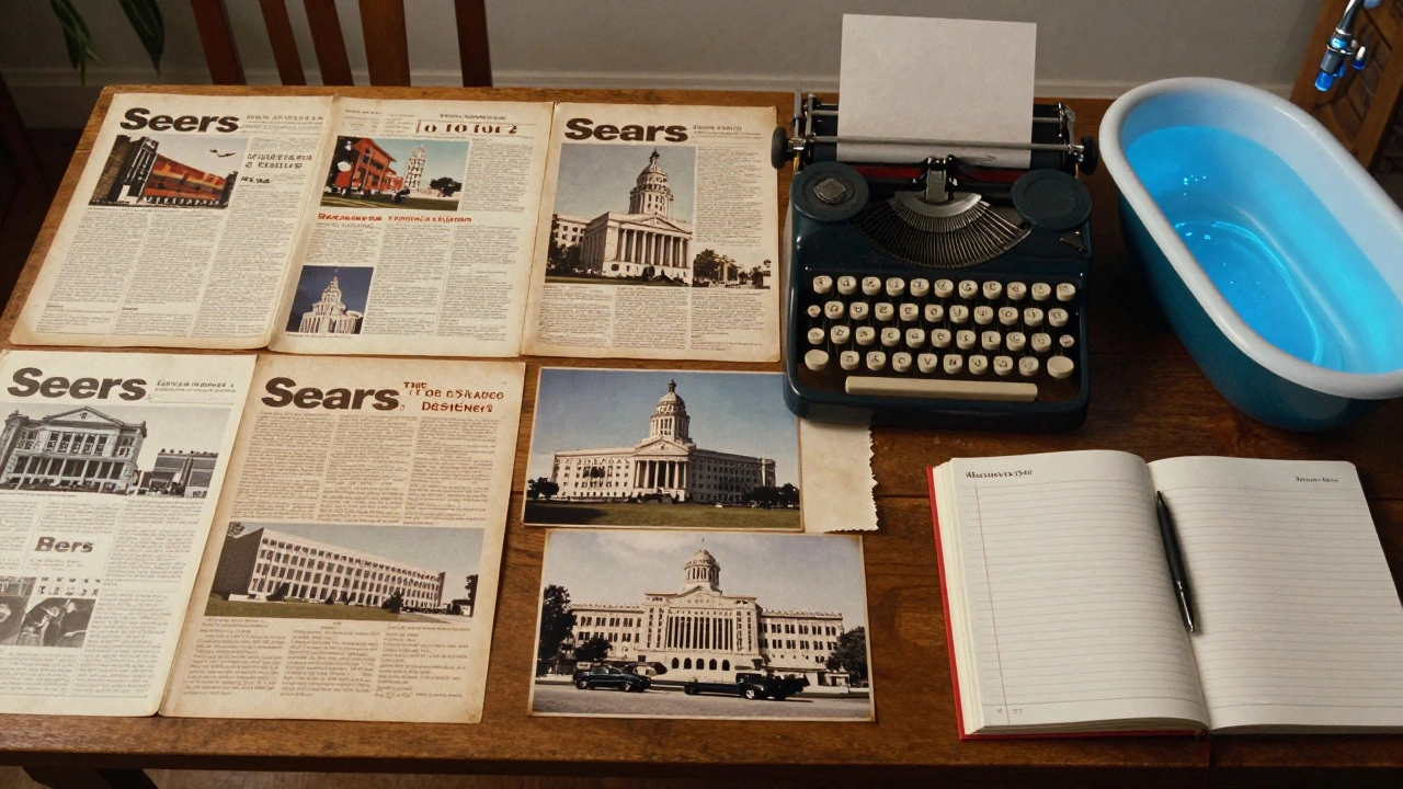
One designer working on a 1910s drama found an old Sears catalog from 1912. It listed prices for everything from coal stoves to baby cribs. That catalog became their bible. They didn’t just pick furniture-they built a whole economy into the set.
Final Thought: Accuracy Isn’t the Goal. Believability Is.
You don’t need to recreate history perfectly. You need to make people believe it exists. Whether you’re sticking to every detail or bending it for emotion, the key is consistency. If you change one thing, change it with purpose.
The best period films don’t make you feel like you’re watching the past. They make you feel like you’re living in it.
Is it better to prioritize historical accuracy or creative stylization in period films?
Neither is inherently better-it depends on the story. Accuracy builds trust, while stylization enhances emotion. The strongest period films use deep research as a foundation and then make intentional creative choices that serve the narrative. A film about a real historical event should lean toward accuracy. A film using history as a metaphor can afford more stylization. The key is consistency: if you break one rule, make sure the rest hold strong.
What are common mistakes in period film design?
Common mistakes include using modern objects disguised as vintage (like a 2000s phone in a 1950s scene), relying on Hollywood clichés (top hats for all nobles, feathered headdresses for all Native Americans), and ignoring how people actually moved. Another big one is over-saturating colors. Real historical interiors were often muted due to natural pigments and lighting. Also, ignoring sound-like the clatter of a real typewriter or the hum of a 1940s refrigerator-can break immersion just as much as a wrong prop.
How much research do top production designers actually do?
Top designers often spend months on research before filming begins. For Mad Men, the team collected over 10,000 reference images. For The Crown, designers studied royal archives, fashion catalogs, and even the exact dimensions of Buckingham Palace rooms. Some designers visit museums daily, handle original artifacts, and interview descendants of people who lived in the era. It’s not just about looking things up-it’s about feeling them.
Can stylization ruin a period film?
Yes-if it’s random. Stylization isn’t a free pass to ignore history. If you change the lighting, costumes, or architecture, there needs to be a reason tied to the story. For example, Amélie used exaggerated color to reflect the protagonist’s inner world. That worked because it was consistent and intentional. But if you suddenly add neon lights to a 1920s speakeasy just because it looks cool, audiences will notice. Stylization must serve the narrative, not just the director’s aesthetic.
What tools do production designers use for period research?
They use digitized archives like the Library of Congress, museum databases, historical newspapers (like Newspapers.com), vintage catalogs (Sears, Montgomery Ward), and even eBay for authentic props. Many also consult with historians, textile experts, and archivists. Some keep physical mood boards with fabric swatches, paint chips, and photographs. Sound design is often overlooked-researching period-specific noises (like the click of a manual typewriter or the whir of a 1930s elevator) helps build immersion.
Period design isn’t about nostalgia. It’s about truth-whether that truth is found in a perfectly restored 1940s kitchen or in a surreal, glowing bathtub that feels like a dream. The best designers know the difference-and they know when to break the rules.


Comments(9)