When a camera rolls, it doesn’t care how much time or money went into the set. It only sees what’s in front of it-light hitting wood, shadows pooling in fabric, dust catching on metal. If the textures don’t read on film, the whole scene falls apart. That’s why production designers don’t just build sets. They build materials that photograph well.
Why Texture Matters More Than You Think
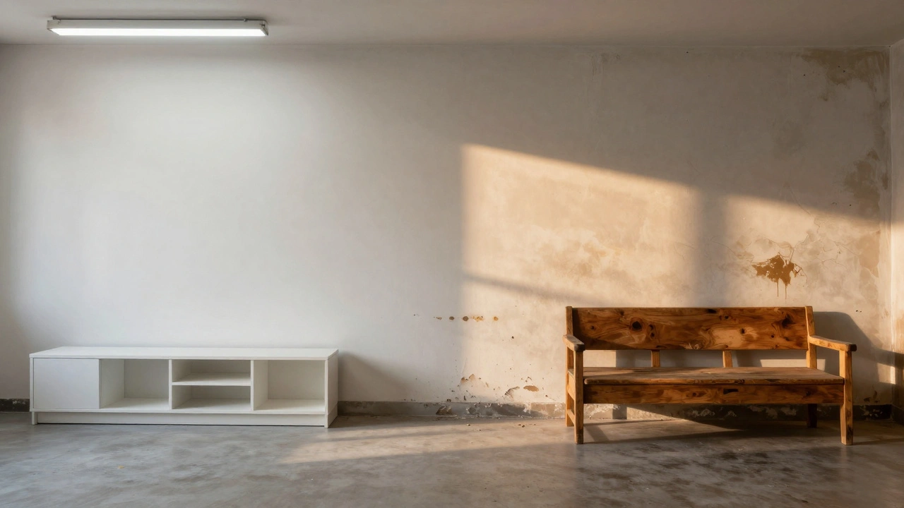
Flat, smooth surfaces kill depth on camera. A white wall painted with flat latex might look fine in person, but under studio lights? It becomes a glowing, lifeless void. A wooden floor sanded too smooth loses its grain and turns into a plastic-looking surface. Cameras capture contrast, not just color. They need roughness, variation, and imperfection to create dimension.
Think about the difference between a modern apartment in a commercial and a 1970s diner in a period drama. One feels sterile. The other feels lived-in. That’s not just props and furniture. It’s the texture of the vinyl booth seats, the chipped paint on the counter, the grease stains on the floor. These aren’t accidents-they’re chosen. Every material is selected for how it interacts with light.
Light Is the Real Director
Texture isn’t about what looks good in a showroom. It’s about what looks good under a 2K HMI, a softbox, or a practical lamp on set. Matte finishes absorb light. Glossy ones reflect it. Too much gloss? You get hot spots that blow out the image. Too much matte? The set looks dead, flat, like a photo from a catalog.
Production designers use this knowledge like a cheat code. For a gritty crime scene, they’ll use aged concrete with exposed rebar. It scatters light in unpredictable ways, creating natural shadows and depth. For a luxury penthouse, they’ll use polished brass and satin-finished glass-controlled reflections that glow without overpowering.
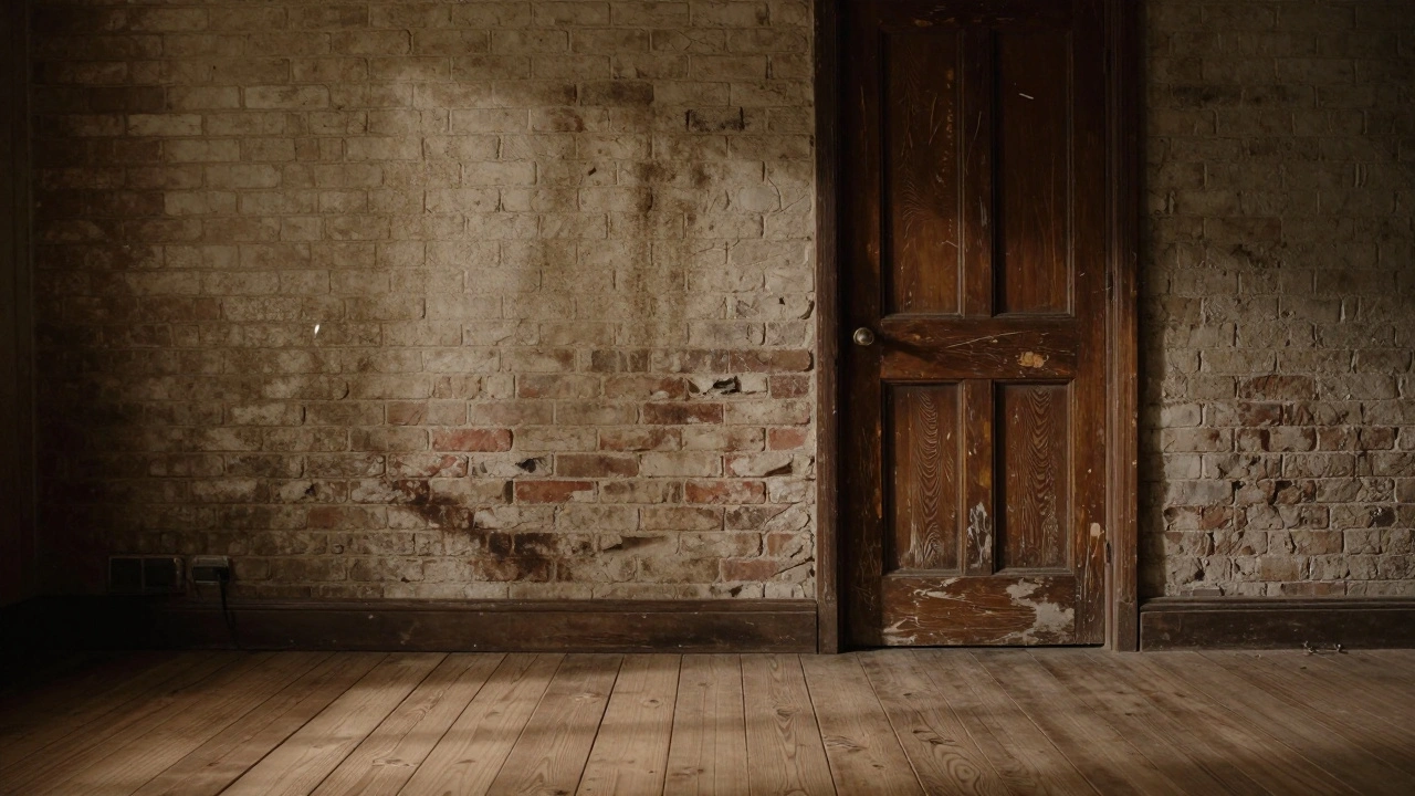
There’s a reason you rarely see new drywall on film sets. Even if the story takes place in a brand-new building, the crew will distress it. They’ll sponge on dirt, rub sandpaper along baseboards, and spray a light coat of gray wash over paint. Why? Because new drywall reflects too evenly. It doesn’t photograph. It screams "fake."
Materials That Photograph Well (And the Ones That Don’t)
Not all materials behave the same under camera lights. Here’s what works-and what doesn’t:
- Real wood (unfinished or lightly sealed) - Grains catch light naturally. Even cheap plywood, when sanded and stained, reads as authentic. Avoid laminates-they look like plastic under close-ups.
- Worn metal (brushed brass, oxidized copper, rusted steel) - Metal reflects, but uneven surfaces break up those reflections. Polished chrome? Only if you want a mirror. Brushed aluminum? Perfect for sci-fi tech panels.
- Textured plaster and stucco - Adds organic variation. Used in period homes, cafes, or gritty urban interiors. Avoid smooth plaster finishes-they’re the enemy of depth.
- Natural fabrics (linen, wool, burlap) - These absorb and diffuse light. A wool blanket on a bed doesn’t just look cozy-it looks real. Synthetic polyester? It glows unnaturally under tungsten lights.
- Weathered brick and stone - No two bricks are the same. That variation creates visual rhythm. New brick? Too uniform. Use aged bricks or spray them with diluted acrylic wash to simulate decades of grime.
- Painted surfaces with imperfections - Flat paint with a slight texture (like a hand-troweled finish) is ideal. High-gloss enamel? Only for accents. It reflects too much.
Materials to avoid:
- Plastic laminate countertops (they reflect like mirrors)
- Neon LED strips (too uniform, too bright)
- Velvet (unless used intentionally-it absorbs so much light it disappears)
- New vinyl flooring (too shiny, too consistent)
- Whiteboard surfaces (they reflect every light source)
How to Age Materials Like a Pro
Nothing looks more fake than a brand-new set. The trick isn’t to make things look old-it’s to make them look used.
Here’s how the pros do it:
- Layer dirt - Start with a light wash of gray or brown acrylic paint thinned with water. Apply with a sponge or rag. Focus on corners, edges, and high-touch areas. Don’t cover everything-leave patches of original color.
- Use wax and grease - Rub candle wax or petroleum jelly on doorknobs, light switches, and handles. Then wipe lightly. It creates that greasy patina from years of hands touching the same spot.
- Scuff and scratch - Use a wire brush on wood edges. Drag a nail along metal to create fine scratches. A belt sander on low speed can distress large surfaces like tabletops or floors.
- Add water stains - Drip diluted coffee or tea on walls near windows or sinks. Let it run down. It mimics decades of condensation and leaks.
- Use real dust - Don’t use fake dust from a bag. Collect fine dust from old buildings, mix it with a little cornstarch, and lightly spray it with hairspray to make it stick. Real dust has different particle sizes and colors.
One of the best tricks? Use materials that already have character. Salvage yards are goldmines. A 1950s kitchen cabinet, even if broken, will have more visual history than a brand-new replica. The patina is already there. You just clean it up and reposition it.
Color Is Secondary to Texture
People think color drives the mood. But on film, texture drives color. A deep red wall covered in fine cracks and grime reads as rich and warm. The same red on a smooth, glossy surface reads as cheap and artificial.
That’s why production designers often choose neutral tones-beige, gray, olive, charcoal. They don’t distract. They let texture do the talking. Even in a colorful film like Amélie, the sets are built with layered textures. The walls aren’t just painted yellow-they’re patched, stained, and worn. The furniture isn’t just retro-it’s scratched, mismatched, and lived-in.
When you’re choosing paint, avoid anything labeled "satin" or "eggshell" unless you’re going for a specific glossy effect. Flat or matte finishes are your best friends. If you need a little sheen, add a touch of clear wax or sealant only where needed-like on a kitchen counter or a table edge.
Working With the Cinematographer
Texture isn’t a production designer’s solo job. It’s a collaboration with the director of photography. The DP knows how the light will fall. The designer knows how the material will react.
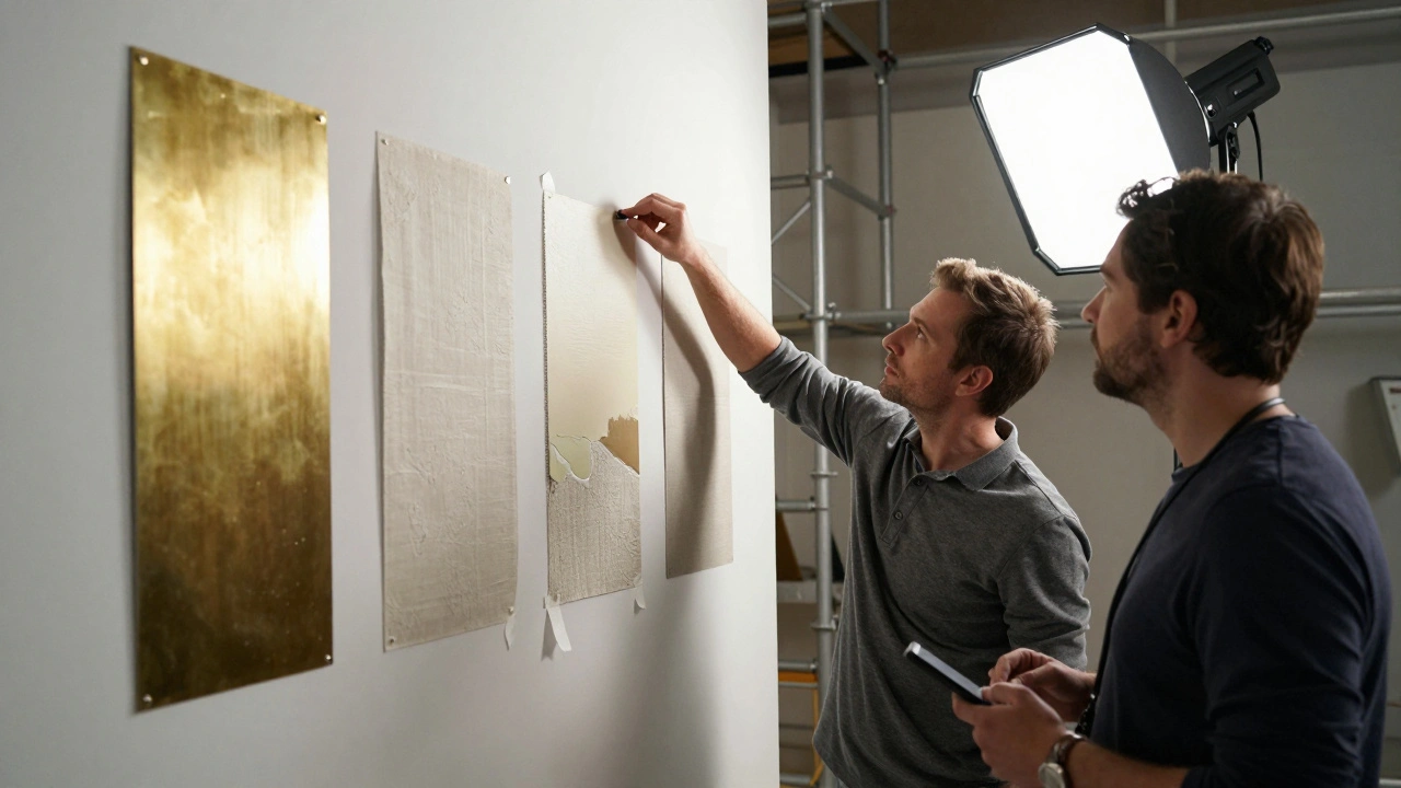
Good teams talk early. Before the set is built, they’ll do material tests. They’ll tape up samples of wood, metal, fabric, and paint on a wall. Then they’ll shoot them under the exact lighting setup they plan to use. If a fabric disappears under a soft key light? They swap it. If a painted surface reflects too much? They change the sheen.
Some DPs even bring their own lighting rigs to the set build. They’ll turn on a 2K lamp and say, "This wall needs more grain." That’s not micromanaging-that’s teamwork.
Real Examples From Real Films
Look at The Grand Budapest Hotel. The hotel’s walls aren’t just pink-they’re layered with aged plaster, hand-painted trim, and scuffed baseboards. The carpet isn’t new-it’s worn thin in the hallways, with visible seams and frayed edges.
In Parasite, the wealthy family’s home has marble floors, but they’re not polished. They’re slightly dull, with faint scratches from years of shoes. The wood paneling has a soft, uneven finish-not glossy, not matte. It’s just right for the soft, diffused lighting.
Even in Mad Max: Fury Road, the desert sets aren’t just sand and rust. The vehicles are covered in layers of dirt, grease, and patched metal. The textures tell you these machines have been driven for years through dust storms. No one had to tell you that. You felt it.
What Happens When Texture Is Ignored
Bad texture makes a film look cheap-even if the budget was huge. You’ve seen it: a modern thriller with a sleek, minimalist apartment. Everything is white, glass, and steel. But under the lights, the walls look like they’re made of foam core. The furniture has no grain. The floor reflects every light source like a mirror.
That’s not minimalism. That’s laziness. It breaks immersion. The audience doesn’t consciously notice the texture. But they feel it’s wrong. Their brain says, "This isn’t real." And once that happens, the story loses its grip.
One of the biggest mistakes? Using stock materials from big-box stores. IKEA furniture looks great in a catalog. On camera? It’s a dead giveaway. The joints are too perfect. The wood grain is printed, not real. The metal is too uniform. It doesn’t age. It doesn’t react to light. It just sits there.
Start With What’s Real
The best way to learn texture? Go outside. Look at an old barn. Notice how the paint flakes in patches. How the wood swells and cracks. How rust bleeds into the metal. Watch how light hits a stone wall at sunset. That’s your reference.
Collect samples. Keep a texture board. Tape up swatches of real wood, fabric, metal, and plaster. Label them. Test them under different lights. Take photos. Over time, you’ll start to recognize what works.
Don’t wait for the set to be built to think about texture. Think about it before you buy a single nail. Every material you choose should pass one test: "Will this photograph well?" If the answer isn’t a clear yes, find something else.
Because in film, what you see isn’t what matters. What the camera sees is.
Why do film sets look more realistic than real homes?
Film sets don’t look more realistic because they’re perfect-they look real because every surface is carefully chosen to react to light in a way that creates depth and texture. Real homes have clutter and random messes. Film sets have controlled imperfections-scratches, stains, and wear that guide the viewer’s eye and make the space feel lived-in without distracting from the story.
Can I use fake materials like foam or plastic on set?
Yes, but only if they’re disguised. Foam can be carved and painted to look like stone or wood. Plastic can be textured with spray-on coatings or layered with dirt and grime. The key isn’t the material-it’s how it’s finished. A foam rock painted with multiple layers of acrylic and sealed with a matte varnish can pass as real stone on camera.
What’s the cheapest way to add texture to a set?
Use dirt, dust, and paint washes. A mix of water, acrylic paint, and a little dish soap can be sprayed or sponged onto walls, floors, and furniture to create instant aging. Salvaged wood from demolition sites, old fabric from thrift stores, and rusted hardware from junkyards cost almost nothing and add authenticity no new material can match.
How do you make metal look old without painting it?
Let it oxidize. Spray copper with vinegar and salt to speed up patina. Use ammonia fumes on brass to create a greenish tint. For steel, dampen it with a saltwater solution and leave it overnight. Then wipe off the excess. The rust and discoloration will bond to the metal naturally. This looks far more real than paint.
Do lighting choices affect how textures appear?
Absolutely. Hard light (like a direct spotlight) emphasizes every bump and crack. Soft light (like a diffused panel) flattens texture. Production designers work with cinematographers to match the texture to the lighting style. A gritty drama uses hard light to highlight rough surfaces. A romantic comedy uses soft light and smooth textures to feel gentle and idealized.


Comments(6)