Have you ever paused a movie just to read the fine print on a receipt or decipher the logo on a coffee cup? That moment is where diegetic design is the creation of visual elements that exist within the story world of a film, such as signs, documents, and brand logos. It is the invisible glue that holds a narrative together. Without it, a scene feels hollow. With it, a fictional city becomes a place you could actually visit. In modern cinema, this discipline has evolved from simple background dressing into a critical storytelling tool that defines character, era, and mood.
Production designers work alongside directors to ensure every piece of paper, every neon sign, and every corporate emblem serves the plot. It is not just about making things look pretty; it is about logical consistency. If a character lives in 1980s New York, their refrigerator magnets shouldn't feature QR codes. This level of detail builds trust with the audience. When we believe the world around the characters is real, we stop noticing the camera and start feeling the story.
The Role of Production Design in World-Building
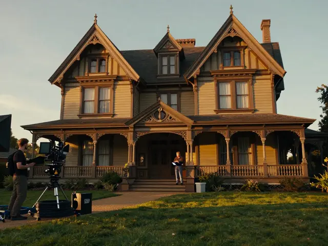
Production design is the overall visual concept and execution of a film's physical environment, including sets, locations, props, and color palettes. While set construction handles the architecture, graphic design handles the texture of daily life. Think of it as the difference between building a house and furnishing it with personal items. The furniture tells you who lives there. Similarly, the posters on the wall tell you what culture dominates that space.
In high-budget blockbusters, teams of art directors spend months researching historical typography and local dialects. For a period piece like *The Grand Budapest Hotel*, the fonts used on hotel brochures had to match the whimsical yet precise aesthetic of the 1930s. For a dystopian thriller, the signage might be utilitarian, using stark sans-serif fonts to reflect a society stripped of individuality. The choice of font is never random. It is a deliberate signal to the viewer about the power dynamics at play in that scene.
Signage: The Language of Space
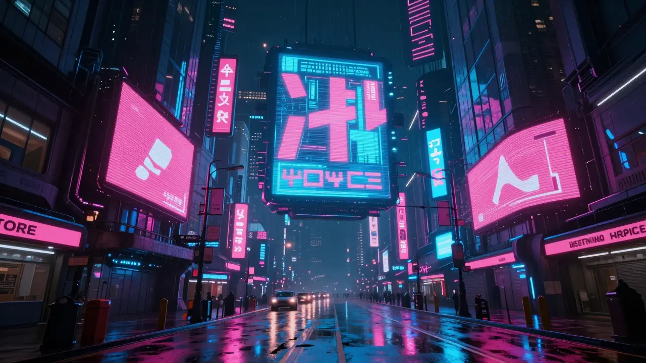
Street signs, shop fronts, and warning labels are the most visible forms of diegetic graphics. They guide the audience’s eye and establish geography. A well-designed street sign does more than show an address; it hints at the history of the neighborhood. Is the paint peeling? Does the sign use outdated English? These details communicate decay or prosperity without a single line of dialogue.
- Wayfinding: Signs help the audience navigate complex set pieces, such as a crowded market or a labyrinthine office tower.
- Cultural Context: Local slang or specific regulatory symbols (like recycling bins) ground the story in a specific country or city.
- Narrative Clues: A "For Sale" sign on a neighbor's house can foreshadow a change in the protagonist's social status.
Consider the film *Blade Runner 2049*. The city of Los Angeles is filled with massive holographic advertisements and dense, layered signage. The clutter isn't accidental. It reflects the overcrowded, commercialized nature of the future society depicted. The text on these signs is often readable but fragmented, mirroring the fragmented identity of the characters.
Logos and Brand Integration
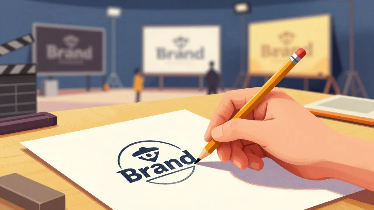
Creating fake brands for movies is a specialized skill known as product design or brand fabrication. Real companies sometimes license their logos for screen visibility, but often, studios invent fictional corporations to avoid legal issues or to better fit the tone. A generic soda can doesn't sell the vibe of a gritty crime drama. A specific, stylized logo does.
| Element Type | Primary Function | Example in Cinema |
|---|---|---|
| Signage | Navigation and Cultural Context | Neon signs in *Drive* |
| Logos | Brand Identity and World Consistency | Oceanic Airlines in *Inception* |
| Paperwork | Character Depth and Plot Mechanics | Files in *The Office* (TV) or *Parasite* |
Fictional logos must withstand close-up scrutiny. Viewers zoom in on phones and screens today. If the logo looks cheap or pixelated, immersion breaks. Designers create full brand identities for these fictional companies, including business cards, letterheads, and even websites that may exist only in the film's universe. This depth of detail rewards attentive viewers and adds layers of realism.
Paperwork and Documents: The Details That Matter
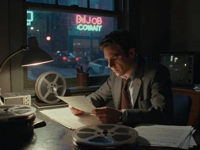
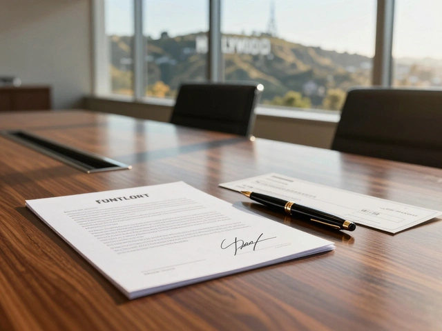
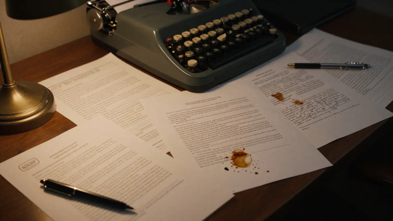
Often overlooked, paperwork is one of the most powerful tools for character development. A desk covered in messy notes suggests a chaotic mind. A pristine, organized filing system suggests control or obsession. In legal dramas or thrillers, the actual content of the documents drives the plot. Contracts, police reports, and medical records need to look authentic to be believable.
Art departments create hundreds of unique documents for a single film. Each page must have consistent margins, correct legal jargon, and appropriate ink stains. In *The Social Network*, the whiteboards covered in equations and diagrams were crucial to showing Mark Zuckerberg's genius. The handwriting style was analyzed to match the actor's natural writing, ensuring the prop felt personal rather than staged.
Historical Accuracy vs. Creative License
Working on period films presents a unique challenge. Did the company exist then? What did their logo look like in 1950 versus 1970? Production researchers dig through archives to find accurate references. However, they also exercise creative license when historical records are sparse. Sometimes, a slightly altered logo helps the audience recognize the brand while keeping the timeline plausible.
For sci-fi or fantasy films, the rules are different. Here, designers create new languages, scripts, and symbol systems. The goal is internal consistency. If a alien race uses a certain geometric pattern for their currency, that pattern should appear on their clothing, architecture, and digital displays. This repetition creates a cohesive visual language that feels native to that world.
The Workflow: From Concept to Screen
The process begins long before filming starts. During pre-production, the production designer creates a visual bible. This document outlines the aesthetic direction for all graphic elements. It includes font choices, color palettes, and material textures. Once approved by the director, the team moves to the drafting phase.
- Research: Gathering reference photos, historical data, and cultural cues.
- Concept Art: Sketching initial ideas for signs and logos.
- Digital Mockups: Creating vector graphics for large-scale printing or projection mapping.
- Physical Fabrication: Printing, painting, or etching the designs onto props and set pieces.
- On-Set Supervision: Ensuring the lighting and camera angles highlight the details correctly.
This workflow requires tight coordination between the art department, costume department, and special effects teams. A logo on a shirt must match the logo on the billboard outside the store. Any mismatch breaks the illusion instantly. Modern software allows for rapid iteration, meaning a design can be changed overnight if the director requests a tweak.
Why Audiences Notice More Than Ever
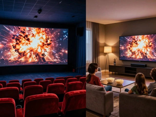
High-resolution cameras and home theater setups mean that details once hidden in the dark corners of a frame are now front and center. Audiences are more educated about film production thanks to behind-the-scenes content online. They know how much effort goes into making a world feel real. This heightened awareness means that sloppy diegetic design is punished harshly by critics and fans alike.
Conversely, exceptional diegetic design earns praise. Fans dissect frames to find easter eggs hidden in newspaper headlines or background posters. This interaction turns passive viewing into an active hunt for details. It extends the life of the film beyond its runtime, creating a community of enthusiasts who appreciate the craftsmanship.
What is the difference between diegetic and non-diegetic graphics?
Diegetic graphics exist within the story world (e.g., a sign on a wall). Non-diegetic graphics are added for the audience's benefit and do not exist in the story (e.g., subtitles, title cards, or lower-third names).
Do film productions always use fictional brands?
No. Many films use real brands through product placement deals. However, if a brand doesn't fit the tone or era, or if licensing costs are too high, designers create fictional alternatives that mimic the real thing.
How do designers ensure historical accuracy in fonts?
They research archival materials from the specific decade or year. They look at newspapers, advertisements, and official documents to identify common typefaces and layout styles of that era.
Is diegetic design important for low-budget films?
Yes. Even with limited budgets, consistent and thoughtful graphic details elevate the production value. A few well-crafted props can make a small film feel professional and immersive.
Who is responsible for creating diegetic graphics?
The production designer leads the effort, working with art directors, graphic designers, and prop makers. The director provides final approval to ensure the visuals align with the narrative vision.