Why Color in Films Isn’t Just Decoration
Ever watched a scene and felt something you couldn’t explain? A chill down your spine, a sudden warmth in your chest? That’s not just the music or the acting. It’s color. Film color isn’t chosen randomly. It’s a silent character in every story. Warm tones like red, orange, and gold pull you into intimacy, nostalgia, or danger. Cool tones like blue, teal, and gray create distance, sadness, or control. When filmmakers mix these, they’re not just making things look pretty-they’re controlling how you feel.
Warm Colors: The Language of Emotion
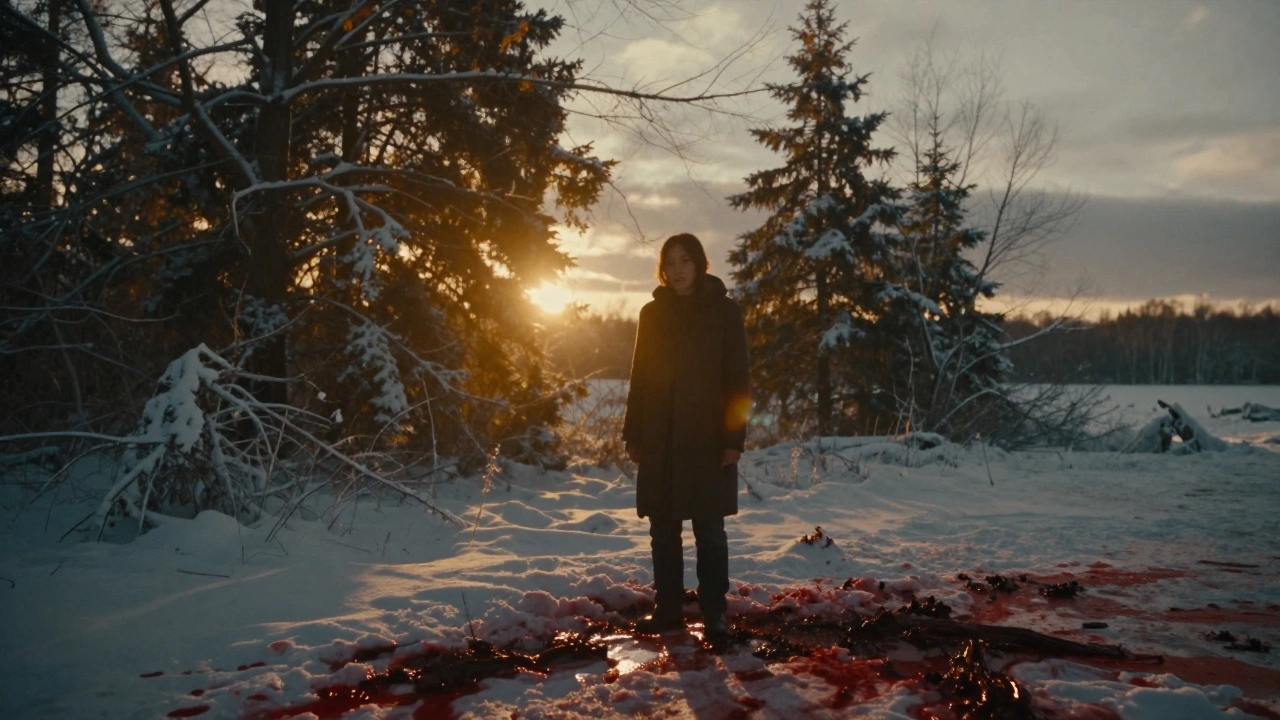
Warm colors in film don’t just look inviting-they make you feel something real. Think of the golden hour in The Revenant. The sun glows low, casting amber light over snow and blood. It’s brutal, but it feels human. That’s warmth telling you: this pain matters. This life is precious.
Red is the most powerful warm tone. In Schindler’s List, the little girl in the red coat is the only splash of color in a black-and-white world. You don’t need dialogue to know what she represents. The red doesn’t just stand out-it screams.
Warm tones are also used to show memory. In Amélie, the whole film glows with golden yellows and soft pinks. It’s not reality. It’s how Amélie sees the world-kind, magical, full of hidden joy. The warmth isn’t just aesthetic. It’s emotional truth.
Cool Colors: The Silence Between Words
Cool colors don’t shout. They whisper. And that’s why they’re so effective for tension, isolation, and power.
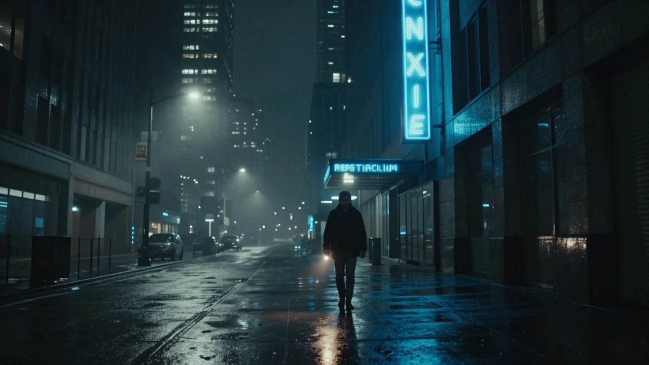
Look at Blade Runner 2049. Almost every scene is bathed in blue, gray, and icy teal. The city feels empty. The characters feel alone. Even when they’re surrounded by people, the cool tones make you feel like you’re watching through glass. That’s not a mistake. That’s the point.
Blue is the color of control. In The Matrix, the green tint of the digital world isn’t just a visual effect-it’s cold logic. The real world? It’s washed in blue-gray. No warmth. No comfort. Just survival.
Cool tones also signal detachment. In Manchester by the Sea, the ocean is always blue. The sky is always pale. The houses are gray. The color doesn’t change because the main character’s grief doesn’t either. The film doesn’t tell you he’s broken. It shows you through color.
When Warm Meets Cool: The Battle Inside the Frame
The most powerful moments in film happen when warm and cool colors fight for space.
In There Will Be Blood, Daniel Plainview’s oil rig glows orange under a cold, gray sky. The fire represents greed, ambition, passion. The sky? It’s indifferent. The world doesn’t care if he burns or builds. That contrast isn’t just visual-it’s moral.
Or take Mad Max: Fury Road. The desert is a burning orange wasteland. But the Citadel, where the tyrant rules, is lit with sickly green and cold blue. The rebels? They’re bathed in warm sunlight as they escape. The color tells you who’s alive and who’s just surviving.
These contrasts aren’t accidents. They’re carefully designed. A filmmaker might use a cool blue filter over a warm interior scene to show how something beautiful is being drained of life. Or they might throw a single warm light into a cold room to show hope is still there-just barely.
How Color Grading Turns Mood Into Science
Color grading isn’t just adjusting brightness. It’s surgery on emotion. A colorist doesn’t just pick filters-they decide how much of the audience’s heart to warm, and how much to freeze.
Take Parasite. The Kim family’s semi-basement apartment has a dull green tint. It’s not dirty. It’s stagnant. The Park family’s modern home? Bright, airy, almost sterile. White walls, soft daylight. It feels clean. But also empty. The color grading tells you one family is fighting to survive, the other is just pretending they’re fine.
Even lighting direction matters. A warm light from below (like a candle or fire) creates shadows that look like claws. It’s used in horror films because it makes people feel unsafe. A cool light from above (like fluorescent office lights) makes faces look flat. It’s used in corporate scenes to show lack of soul.
Color palettes are built frame by frame. In La La Land, the opening number is bathed in saturated pastels. But when Mia and Sebastian argue, the scene shifts to cooler tones. The music is still there. The dancing is still there. But the color tells you the connection is breaking.
Real Examples: What Works and What Doesn’t
Not every film uses color well. Some overdo it. Some ignore it entirely.
Watchmen uses color like a weapon. The entire film is muted except for one thing: the Comedian’s button. It’s bright yellow. It’s the only thing that stays the same from start to finish. It’s a symbol of innocence lost. That’s precision.
On the other hand, some superhero movies drown in blue. Man of Steel is almost entirely teal and gray. It looks expensive. But it feels cold. You don’t feel Superman’s humanity-you just feel the budget. That’s when color fails: when it’s used for style, not story.
Compare that to The Grand Budapest Hotel. Every frame is a pastel dream. Pink, lavender, mint. It’s absurd. But it’s also deeply emotional. The color tells you this is a fairy tale. And fairy tales aren’t just for kids-they’re for people who need to believe in kindness.
What Filmmakers Learn from This
Color isn’t about what looks good. It’s about what feels true.
Good filmmakers don’t pick colors because they’re trendy. They pick them because they match the emotional arc of the story. If a character starts in darkness and ends in light, the color should change with them. If a relationship dies, the warmth should fade.
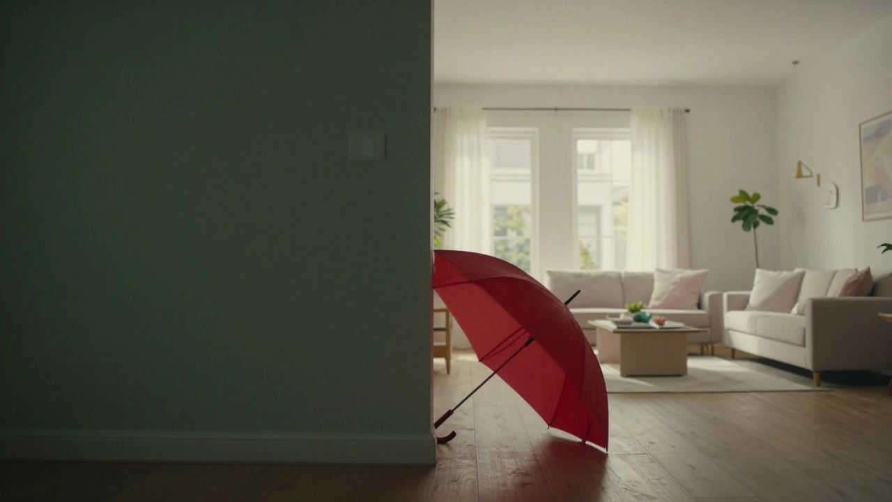
It’s why indie films often win awards for cinematography. They don’t have big budgets for CGI. But they have big ideas about how color moves people. A single red umbrella in a gray city can say more than a whole monologue.
When you watch a film next time, pause it. Look at the colors. Not just the main scene-look at the shadows, the background, the edges of the frame. Ask yourself: Why is this blue? Why is that red? What am I supposed to feel?
Because color doesn’t just decorate the story. It writes it.
How to Spot Color Contrast in Your Own Viewing
You don’t need a film degree to see how color works. Here’s how to train your eye:
- Watch a scene with the sound off. Can you still feel the mood? If yes, color is doing the work.
- Pause on a character’s face. Is their skin lit with warm or cool light? That tells you how the story views them.
- Notice the background. Is it warm while the foreground is cool? That’s a visual metaphor for isolation or conflict.
- Track how color changes over time. Does it get warmer as the character heals? Cooler as they lose control?
- Compare two scenes. One with high contrast (bright red against deep blue). One with flat tones. Which one feels more intense?
It’s not about memorizing rules. It’s about noticing patterns. And once you start seeing them, you’ll never watch a movie the same way again.


Comments(7)