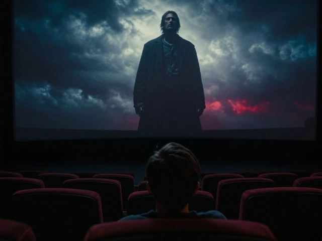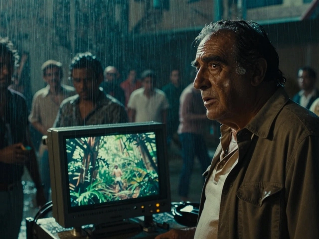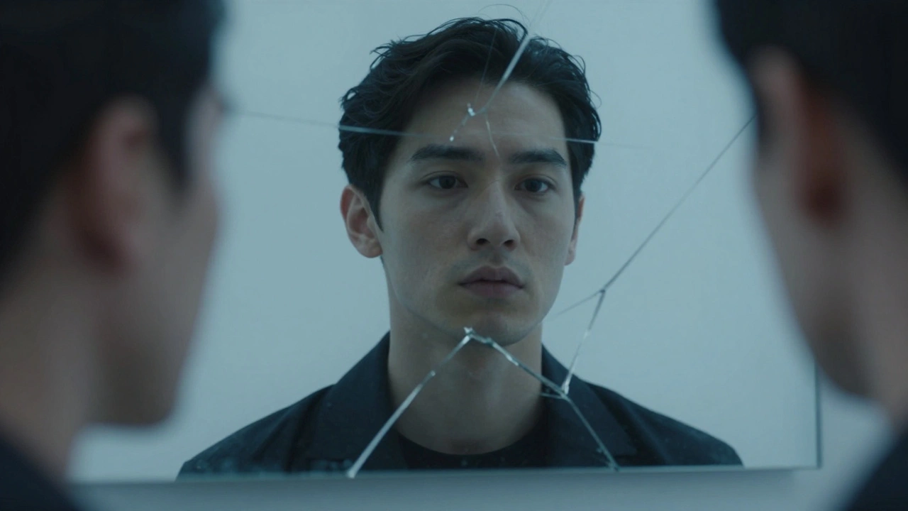
You watch the first three minutes of a movie. The camera lingers on a cracked mirror. A character adjusts their tie with rigid precision. The lighting is cold, blue, and flat. You don’t need the credits to roll to know who directed it. That is the power of a film signature, defined as the unique visual and stylistic identity that distinguishes a director's work across different projects. It isn't about flashy special effects or expensive sets. It is about consistency. It is about repeating specific visual choices until they become part of your language.
Many aspiring directors focus entirely on plot twists or dialogue. They forget that cinema is a visual medium first. If you want audiences-and producers-to recognize your work instantly, you need to master visual motifs, which are recurring visual elements, symbols, or patterns used by a director to reinforce themes, characters, or emotions throughout a film. These motifs act like fingerprints. They tell the audience what the story is really about before a single line of exposition is spoken.
What Exactly Is a Visual Motif?
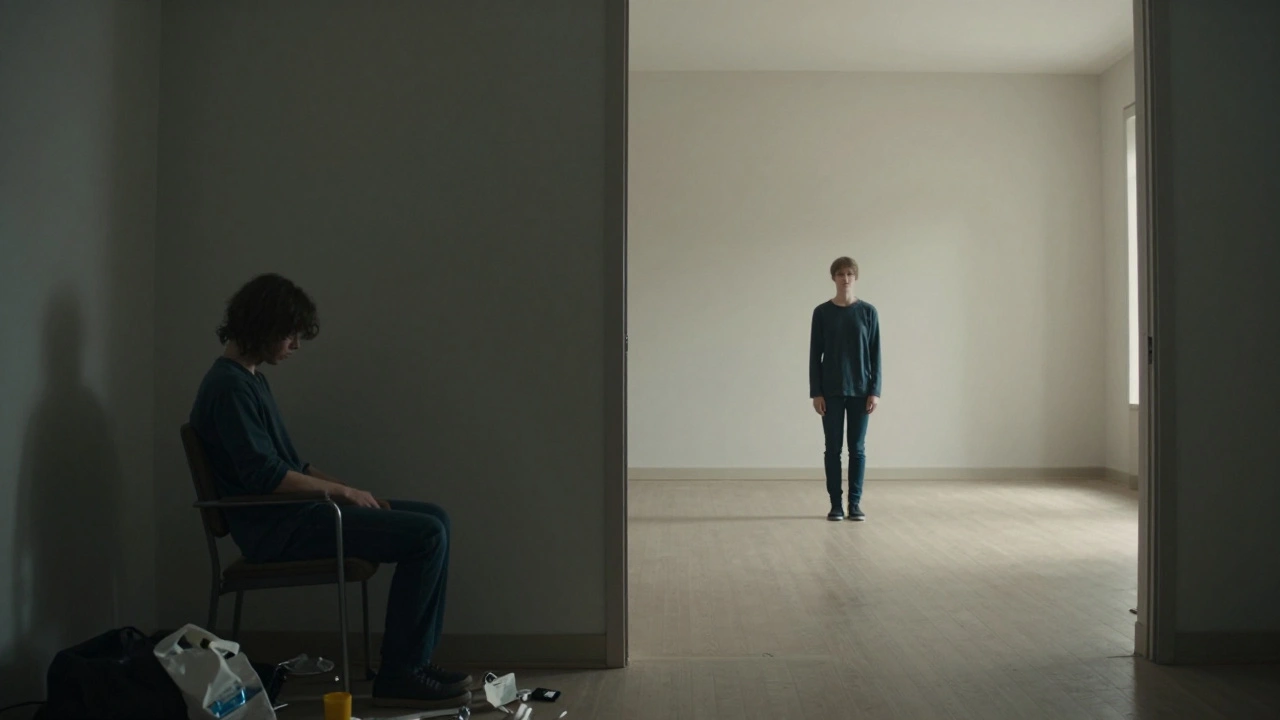
A motif is not just a prop. A chair is just a chair. But if every time a character feels trapped, they sit in a cramped, low-backed chair under harsh overhead lighting, that chair becomes a motif. It carries meaning. In directing, a visual motif is a deliberate repetition of an image, color, shape, or movement that connects different scenes thematically.
Think of it as a visual rhyme. In poetry, a rhyme ties two lines together. In film, a motif ties two scenes together. When Alfred Hitchcock uses spiral staircases, he isn't just showing architecture. He is signaling anxiety, vertigo, and moral descent. When Wes Anderson uses symmetrical compositions, he isn't just being neat. He is signaling control, order, and emotional detachment.
To build your own signature, you must move beyond accidental aesthetics. You need to choose elements that serve the story. A motif works when it does one of three things:
- Reinforces Theme: If your theme is isolation, use wide shots with small figures against vast backgrounds.
- Characterizes People: If a character is chaotic, surround them with cluttered frames and handheld camera movements.
- Creates Rhythm: Repeat specific cuts or transitions to create a subconscious pace for the viewer.
The Core Elements of Visual Storytelling
Before you can repeat something, you have to decide what to repeat. Your visual toolkit consists of several key components. Each one can become a pillar of your directorial style.
Composition and Framing is how you arrange elements within the shot. Do you prefer tight close-ups that force intimacy? Or do you favor extreme long shots that emphasize environment over individual? Christopher Nolan often uses wide-angle lenses to distort space, creating a sense of unease even in calm scenes. This choice tells us that reality is malleable in his films.
Color Palette is perhaps the most immediate identifier. Guillermo del Toro’s world is often drenched in deep greens, blacks, and bioluminescent blues. This palette signals mystery, darkness, and the supernatural. Conversely, Greta Gerwig might use warm pastels and soft textures to evoke nostalgia and childhood innocence. Your color choices should reflect the emotional temperature of your story.
Lighting Style defines the mood. High-key lighting (bright, few shadows) suggests openness and safety. Low-key lighting (high contrast, deep shadows) suggests danger and secrecy. Consider the chiaroscuro technique used in film noir. The stark contrast between light and dark mirrors the moral ambiguity of the characters. If you consistently use natural light, you signal realism. If you use stylized, artificial light, you signal drama or fantasy.
Camera Movement dictates energy. A static camera implies stability, observation, or rigidity. A handheld camera implies chaos, immediacy, or subjectivity. Steadicam or gimbal shots suggest fluidity and grace. Think of the long takes in Birdman. The continuous movement creates a dreamlike, unbroken reality that traps the audience inside the protagonist’s psyche.
How to Identify and Develop Your Own Motifs
Finding your signature doesn’t happen overnight. It requires self-awareness and experimentation. Start by looking at your previous work. What do you gravitate toward naturally? Do you always shoot reflections? Do you love tracking shots? Do you obsess over symmetry?
Here is a practical exercise to identify your instincts:
- Watch Your Work Backwards: Watch your previous short films or student projects without sound. Focus only on the images. What stands out? What feels repetitive?
- Analyze Your Influences: List five directors you admire. For each, write down three visual traits they share. Now, look for overlaps with your own preferences.
- Define Your Themes: What subjects do you care about? Memory? Identity? Urban alienation? Choose visual metaphors that match these abstract concepts.
Once you have identified potential motifs, test them. Don’t force a mirror motif into a scene where it doesn’t belong. Instead, ask: "Does this image help me say something I can’t say with dialogue?" If the answer is yes, keep it. If no, cut it.
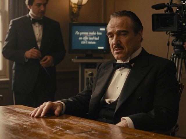
Remember, a motif must evolve. It shouldn’t be a static decoration. In The Godfather, oranges appear before moments of death or violence. At first, they seem random. By the end, the audience flinches when they see an orange. The motif gains weight through repetition and context.
Case Studies: Directors Who Mastered Visual Signatures
Studying masters helps you understand how motifs function in practice. Let’s look at a few distinct examples.
| Director | Key Visual Motif | Psychological Effect | Example Film |
|---|---|---|---|
| Wes Anderson | Perfect Symmetry & Pastel Colors | Order, Control, Nostalgia | The Grand Budapest Hotel |
| David Fincher | Obsessive Detail & Cold Green Tones | Anxiety, Precision, Cynicism | Se7en |
| Spike Lee | Dutch Angles & Red/Yellow/Blue Palette | Tension, Cultural Identity, Chaos | Do the Right Thing |
| Aguirre / Alejandro González Iñárritu | Long Takes & Natural Light | Immersion, Realism, Uncomfortable Intimacy | Roman Polanski's Repulsion / Birdman |
Notice how David Fincher’s obsession with detail creates a sense of paranoia. His characters live in worlds where everything is measured, controlled, and ultimately fragile. The cold green tint reinforces this clinical, detached atmosphere. It’s not just a filter; it’s a worldview.
Spike Lee’s use of Dutch angles (tilted cameras) immediately signals instability. Combined with his bold primary colors, his style screams urgency and social tension. You never feel neutral watching a Spike Lee film. You feel engaged, challenged, and sometimes uncomfortable.
Common Pitfalls in Using Visual Motifs
It is easy to go wrong. Many new directors fall into the trap of style over substance. Here are the biggest mistakes to avoid.
Overusing the Motif: If you show a clock in every scene, it stops being meaningful and starts being annoying. Restraint is key. Use the motif sparingly to maintain its impact. Save it for moments that truly matter.
Ignoring Context: A motif must fit the narrative. Putting neon lights in a period drama about rural poverty makes no sense unless you are making a very specific point about artificiality. Always ask if the visual choice serves the story.
Being Too Predictable: While consistency builds recognition, predictability kills interest. Vary your approach slightly. If you usually shoot from eye level, try a high angle once to break the pattern. Keep the audience guessing while still feeling familiar.
Forgetting Sound: Visual motifs work best when paired with auditory motifs. A recurring musical theme, a specific sound effect, or even silence can amplify the visual message. Think of the shower scene in Psycho. The screeching violin matches the jagged editing. Together, they create terror.
Practical Steps to Implement Motifs in Pre-Production
You cannot rely on improvisation alone. Building a signature requires planning. Here is how to integrate motifs into your workflow.
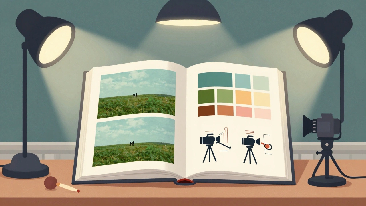
1. Create a Lookbook: Gather images, paintings, and photos that represent your desired aesthetic. Share this with your cinematographer and production designer. Ensure everyone understands the visual goal.
2. Script Analysis: Read your script and highlight scenes where visual reinforcement is needed. Mark spots where a motif could replace dialogue. For example, instead of saying "I’m lost," show the character walking through a maze-like subway station.
3. Shot Lists: Plan your camera angles and movements deliberately. If you want to use framing to isolate a character, specify this in your shot list. Don’t leave it to chance on set.
4. Color Scripts: Work with your colorist early. Define the color palette for each act of the film. Does the story start warm and end cold? Plan the transition.
Why Consistency Matters More Than Perfection
Your film signature is not about making perfect images. It is about making recognizable ones. Audiences connect with voices they trust. A consistent visual style builds that trust. It tells the audience, "This is my perspective. This is how I see the world."
When you develop a strong visual motif strategy, you stand out in a crowded market. Producers remember directors who have a point of view. They hire people who can bring a unique texture to their stories. Your signature is your brand.
Start small. Pick one element-maybe it’s doorways, maybe it’s rain, maybe it’s negative space-and commit to it. Explore it deeply. Let it evolve. Over time, these small choices will accumulate into a powerful artistic identity. You won’t just be telling stories; you’ll be painting with light, shadow, and composition.
What is the difference between a visual motif and a symbol?
A symbol is a single object or image that represents an idea (e.g., a dove representing peace). A visual motif is a recurring pattern or element that appears multiple times throughout a film to reinforce a theme or character trait. Symbols are static; motifs are dynamic and cumulative.
Can I change my visual signature between films?
Yes, but subtly. Audiences expect some consistency from a director. If you shift styles completely, you may lose your established audience. However, adapting your signature to fit different genres or tones shows versatility. The core elements of your style (like composition or pacing) should remain recognizable even if the color palette changes.
How do I choose a color palette for my film?
Start with the emotion you want to evoke. Warm colors (reds, oranges, yellows) suggest passion, anger, or comfort. Cool colors (blues, greens, purples) suggest sadness, isolation, or mystery. Consider the setting and time period. Then, limit your palette to 3-4 dominant colors to create cohesion. Avoid using too many competing hues unless chaos is your goal.
Is it okay to copy another director's visual style?
Copying is dangerous because it lacks authenticity. Instead, study and analyze. Understand why certain techniques work for other directors. Then, adapt those principles to your own voice and stories. Homage is respectful; plagiarism is derivative. Your signature should come from your unique perspective, not imitation.
How important is camera movement in building a signature?
Very important. Camera movement dictates the rhythm and energy of your film. Static cameras feel observational and stable. Handheld cameras feel intimate and chaotic. Smooth tracking shots feel elegant and controlled. Choosing a consistent movement style helps define your directorial voice and guides the audience's emotional response.
What should I do if my budget limits my visual choices?
Constraints breed creativity. If you can't afford elaborate sets or complex camera rigs, focus on composition, lighting, and performance. A simple frame with strong lighting and a powerful actor can be more memorable than an expensive spectacle. Use natural light, found locations, and clever editing to enhance your visual style without breaking the bank.