When you watch an animated film like Spider-Man: Into the Spider-Verse or Studio Ghibli’s My Neighbor Totoro, you don’t just see characters moving. You feel the weight of a scene, the tension in a silence, the rush of a chase. That’s not magic. It’s layout and camera work-carefully designed choices that turn drawings into emotion.
What Is Layout in Animation?
Layout in animation isn’t just about placing characters on a background. It’s the blueprint for how space works in every shot. Think of it as the set designer, the cinematographer, and the choreographer rolled into one. Layout artists decide where the camera sits, how far objects are from each other, and how lines and shapes guide your eye.
In traditional hand-drawn animation, layout artists worked on paper with rulers and French curves. Today, they use digital tools like Toon Boom Harmony or Adobe Animate, but the principles haven’t changed. A well-designed layout tells you where to look, how to feel, and even what’s coming next.
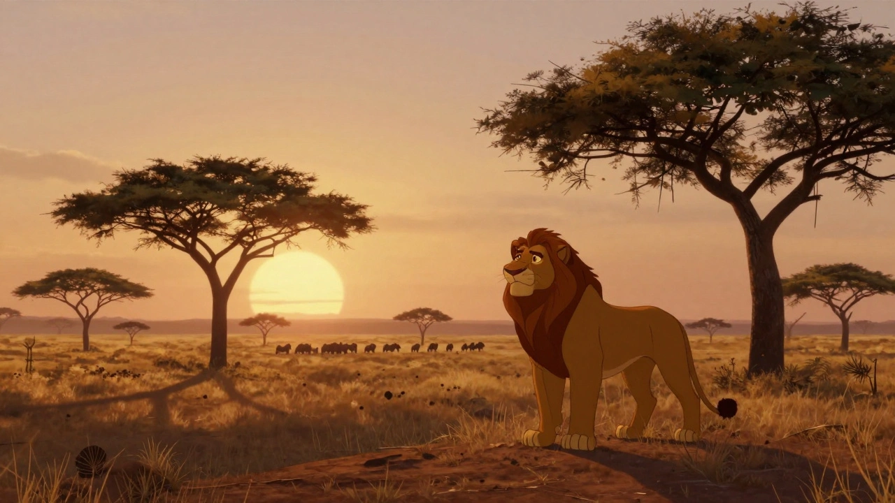
For example, in The Lion King, the opening sequence uses wide, sweeping layouts to show the vastness of the Pride Lands. The horizon dips low, the trees are sparse, and the sun rises just above the edge of the frame. You don’t need dialogue to know this is a moment of awe. The layout does it for you.
How Camera Movement Shapes Emotion
Animated films don’t have real cameras, but they use camera language just like live-action films. A zoom-in isn’t just about getting closer-it’s about intimacy. A slow pan isn’t just movement-it’s about revelation.
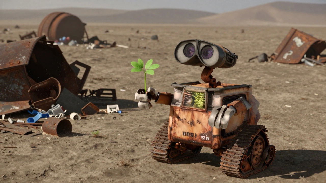
Take the scene in Wall-E where Wall-E finds the plant. The camera slowly pushes in from a wide shot of the desert wasteland, through the debris, until it stops on the tiny green sprout in his hand. There’s no music, no voice. Just the sound of wind and the rustle of plastic. The camera movement tells you this is sacred. This is hope.
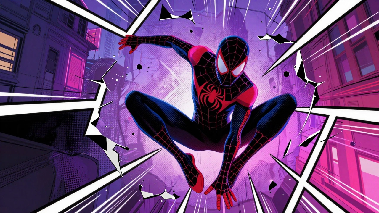
Camera angles matter too. A low-angle shot makes a character feel powerful. A Dutch tilt (a tilted horizon) creates unease. In Spider-Man: Into the Spider-Verse, when Miles first transforms, the camera spins wildly, the lines warp, and panels fracture. It’s not just flashy-it’s the visual representation of panic and disorientation.
Even static shots can be powerful. In Grave of the Fireflies, a quiet scene of two children sitting on a hillside is framed with the sky taking up 80% of the frame. The emptiness isn’t empty-it’s grief. The camera doesn’t move because nothing can fix what’s happened.
Composition: The Hidden Rules
Layouts follow unspoken rules of composition. The rule of thirds? Yes. Leading lines? Absolutely. But animation takes it further.
Animators use shape language. Round shapes feel safe. Sharp angles feel dangerous. In Howl’s Moving Castle, the castle itself is a chaotic mix of towers, chimneys, and crooked walkways. It feels alive because its shape contradicts the clean geometry of the human world around it.
Color and contrast do the heavy lifting too. In Bluey, a children’s show, the background is often soft pastel, but when Bluey’s dad gets serious, the colors darken slightly, and the lighting becomes more directional-like a spotlight on his face. You don’t need words to know he’s about to say something important.
Depth is another trick. In 2D animation, artists fake 3D space with overlapping layers. A foreground tree, a midground character, and a distant mountain aren’t just stacked-they’re spaced to create a sense of distance. In Princess Mononoke, when Ashitaka rides through the forest, the trees in front blur slightly as he moves. The background shifts slower. That’s motion parallax. It’s how your brain reads depth in real life-and animators copy it perfectly.
Why Layouts Are More Important Than You Think
Many people think animation is about movement. It’s not. It’s about control. Every frame is a choice. A character looking left instead of right changes the whole meaning. A door placed off-center makes the room feel wrong. A shadow stretching longer than it should hints at something lurking.
Studio Ghibli’s Hayao Miyazaki famously refused to use storyboards for My Neighbor Totoro. Instead, he drew layout sketches with loose lines and wrote notes like: “The girls feel the wind.” That’s not a shot-it’s a feeling. The layout had to carry the emotion, because the story didn’t spell it out.
Modern animation often overuses camera zooms and quick cuts because it’s easier. But the best animated films use stillness. In When Marnie Was There, there’s a 90-second shot of a girl sitting by the ocean, staring at the horizon. No dialogue. No music. Just the tide. The layout holds you there because it trusts you to feel it.
Real-World Examples That Changed Animation
Some films didn’t just use layout-they redefined it.
- Persepolis used simple black-and-white layouts to mirror the protagonist’s internal struggle. The lack of color wasn’t a limitation-it was the point.
- Spider-Man: Into the Spider-Verse broke every rule: comic book panels, halftone dots, misaligned lines. The layout wasn’t trying to be realistic-it was trying to feel like a comic book come to life.
- The Secret of Kells used Celtic knotwork as background patterns. The layout didn’t just show a monastery-it became part of the story’s soul.
These films didn’t just tell stories. They made you feel them through space, light, and framing.
What Happens When Layouts Go Wrong
Bad layout feels flat. Characters look like they’re floating. Scenes feel disconnected. You can’t tell where one object ends and another begins.
Some animated films try to mimic live-action camera moves but forget that animation doesn’t have physical limits. A dolly zoom in a real film uses lens physics. In animation, if you zoom too fast without adjusting the background, it looks like the scene is glitching.
Another common mistake? Overcrowding. Too many elements in a frame confuse the eye. In Shrek, early test scenes had too many background details-trees, signs, animals-all fighting for attention. The final version simplified it. The focus stayed on Shrek’s face. That’s layout discipline.
And then there’s the “no depth” trap. Some studios, especially in TV animation, use flat backgrounds because they’re cheaper. But that makes every scene feel like a poster. You lose immersion. The audience checks out.
How to Appreciate Layout Like a Pro
Next time you watch an animated film, pause it. Not to rewind. Just to look.
- Where is the light coming from? Does it match the mood?
- Are characters centered, or pushed to one side? Why?
- Do the lines in the background lead your eye toward the action?
- Is there negative space? Is it empty-or intentional?
Try watching Toy Story without sound. You’ll still understand Woody’s fear, Buzz’s confusion, and the baby’s curiosity. That’s layout doing its job.
Animation doesn’t need dialogue to move you. It just needs a good frame.


Comments(7)