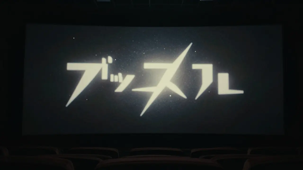
Think about the last movie that stuck with you. Chances are, it wasn't just the plot or the dialogue. It was how the story felt from the very first second. That feeling often starts before the first line of dialogue is spoken. It begins with the Title Sequence is the opening visual narrative that establishes the tone, theme, and aesthetic identity of a film. This isn't just text on a screen; it's a critical component of Production Design, which encompasses all visual elements including sets, costumes, props, and typography to create a cohesive world. When done right, these opening credits don't just list names-they set the stage for the entire viewing experience.
Many viewers scroll past titles without noticing them, but filmmakers know they are doing heavy lifting. A well-crafted sequence can signal whether a movie is a gritty thriller, a whimsical comedy, or a sweeping epic. It creates an immediate emotional connection. If the visuals clash with the intended mood, the audience feels it instantly. This is why modern directors treat title design as seriously as scriptwriting or cinematography.
The Role of Typography in Setting Tone
Typography is the voice of the title sequence. Before you hear a single word, the font tells you how to feel. For a sci-fi blockbuster like Dune, designers chose sharp, angular letters that felt ancient yet futuristic. This choice reflected the harsh desert environment and the political intrigue of the story. In contrast, a lighthearted animated feature might use rounded, bouncy fonts that suggest playfulness and safety.
You need to consider three key attributes when selecting typefaces:
- Legibility: Can the viewer read the names quickly? Complex designs shouldn't obscure the essential information.
- Personality: Does the font match the genre? Serifs often imply tradition or seriousness, while sans-serifs feel modern and clean.
- Movement: How does the text behave? Does it fade in slowly, snap onto the screen, or morph into other shapes?
Take the 2019 film Spider-Man: Into the Spider-Verse. The title sequence used comic book aesthetics, halftone dots, and bold outlines. This didn't just look cool; it reinforced the idea that the movie was breaking the fourth wall of traditional animation. The typography itself was a character.
Motion Graphics: Bringing Static Elements to Life
Static titles are rare in modern cinema. Motion Graphics is the art of animating graphic elements to convey information or emotion through movement. This discipline blends graphic design, animation, and video editing. Tools like Adobe After Effects and Cinema 4D allow artists to manipulate text, shapes, and particles in real-time.
Movement adds rhythm. A fast-cutting action movie needs titles that flash by quickly, matching the pacing of the trailer. A slow-burn drama benefits from titles that drift gently across the screen, giving the audience time to settle into the atmosphere. The speed of the animation should mirror the editing pace of the film itself.
Consider the difference between two approaches:
- Subtle Animation: Text fades in with a slight blur effect. This works well for psychological thrillers where uncertainty is key.
- Dynamic Animation: Text shatters, explodes, or transforms. This suits action films or high-energy comedies.
In both cases, the goal is consistency. If the main title uses a smooth, flowing motion, the actor names should follow the same rule. Mixing chaotic animations with calm ones can confuse the viewer and break immersion.
Color Psychology and Visual Cohesion
Color is perhaps the most powerful tool in your palette. It bypasses logic and hits emotion directly. A deep blue palette suggests calm, sadness, or mystery. Bright yellows evoke energy, optimism, or warning. Red signals danger, passion, or urgency.
When designing a title sequence, you must align the color scheme with the rest of the film's Visual Language, which refers to the consistent use of colors, lighting, and composition throughout a production. If the movie is shot in desaturated tones, bright neon titles will feel out of place. They will pop too much, distracting from the serious mood.
Here is a simple guide to common color associations in film titles:
| Color | Emotional Impact | Best For Genres |
|---|---|---|
| Black | Mystery, Elegance, Finality | Noir, Horror, Drama |
| White | Purity, Clarity, Coldness | Sci-Fi, Minimalist, Medical |
| Red | Passion, Danger, Urgency | Action, Romance, Thriller |
| Blue | Calm, Sadness, Technology | Drama, Sci-Fi, Noir |
| Yellow | Energy, Caution, Joy | Comedy, Adventure, Horror (accents) |
Don't just pick a color because it looks nice. Ask yourself: what feeling do I want the audience to have in the first ten seconds? Then, choose the color that triggers that specific emotion.
Integrating Sound Design with Visuals
Titles aren't silent. The audio track plays a huge role in how we perceive the visuals. A whoosh sound can make a letter appear heavier. A soft chime can make a transition feel gentle. Ignoring sound design is a common mistake that weakens the impact of even the best-looking graphics.
Sound effects should be synchronized with the movement of the text. If a word slides in from the left, the sound should start slightly before the visual arrives, creating a sense of anticipation. This technique is called pre-lapping. It makes the sequence feel more fluid and professional.
Music also matters. If the film has a distinct musical motif, incorporating snippets of it into the title sequence helps tie everything together. Think of the iconic brass fanfare in Jaws. Even if you haven't seen the shark yet, the music tells you something dangerous is coming. The same principle applies to titles. Use the score to guide the viewer's emotional state.
Case Studies: Success and Failure
Looking at real examples helps clarify these principles. Let's compare two different approaches to see what works and what doesn't.
Success: Blade Runner 2049
The title sequence for this film was minimalist and stark. White text on a black background, with subtle grain effects that mimicked old film stock. The movement was slow and deliberate. This matched the film's themes of memory, identity, and the passage of time. It didn't try to dazzle; it tried to immerse. The result was a sequence that felt like part of the story, not an interruption.
Failure: Over-Animated Action Titles
Some recent action movies use titles that move too fast, change colors randomly, and include excessive particle effects. While visually busy, these sequences often fail to establish a clear tone. The audience gets overwhelmed before the story even begins. The lack of restraint makes the design feel cheap rather than exciting. Simplicity often wins over complexity when it comes to establishing brand identity.

Practical Tips for Designers and Filmmakers
If you are working on a project, here are some actionable steps to ensure your title sequence supports your film's identity:
- Start with the Script: Read the opening scene. What is the mood? Is it tense, joyful, or mysterious? Let that dictate your design choices.
- Create a Mood Board: Gather images, fonts, and color palettes that reflect the film's aesthetic. Share this with your director early to get alignment.
- Prototype Early: Don't wait until the end of post-production to test your titles. Create a rough animation with placeholder audio. Show it to a small group. Do they understand the tone immediately?
- Keep It Simple: Less is usually more. If you aren't sure if an element adds value, remove it. Clutter kills clarity.
- Sync with Music: Work closely with the composer. Ensure the timing of the text matches the beats of the music.
Remember, the title sequence is the handshake between the film and the audience. Make it firm, warm, and memorable.
Frequently Asked Questions
How long should a title sequence be?
There is no fixed rule, but most standard title sequences range from 30 seconds to 2 minutes. Shorter films may have shorter sequences, while epics can afford longer introductions. The key is to keep it engaging enough that the audience doesn't lose interest before the story starts.
What software is best for creating motion graphics titles?
Adobe After Effects is the industry standard for 2D motion graphics. For 3D elements, Cinema 4D or Blender are popular choices. Many studios use a combination of both to achieve complex visual effects. Choose tools that fit your team's skill set and budget.
Do title sequences affect box office performance?
Indirectly, yes. A strong title sequence creates buzz on social media and in trailers. Memorable titles encourage sharing and discussion. While it won't guarantee tickets sold, it contributes to the overall marketing package that drives initial audience interest.
Should the title sequence match the ending credits?
Ideally, yes. Consistency reinforces the film's identity. Using similar fonts, colors, and motion styles in both the opening and closing credits creates a complete visual loop. However, the ending credits can sometimes be more experimental since the audience is already invested in the story.
How do I handle casting changes after title design is complete?
This is a common challenge. To avoid rework, design templates that allow for easy name swaps. Keep the layout flexible so that longer or shorter names don't break the composition. Communicate with your producer early about potential casting uncertainties.