Imagine a scene where the only colors you see are shades of grey and a single, piercing red. The tension isn't just in the dialogue; it's in the walls, the clothes, the props. This is the power of minimalist film design, which uses a restricted set of colors and objects to create intense emotional impact and clear narrative focus. When you strip away the noise, every remaining element screams louder.
Production designers often face the temptation to fill every frame with detail. But working with a limited palette forces a discipline that transforms clutter into clarity. It’s not about having less for the sake of being 'artsy.' It’s about controlling exactly what the audience feels and notices. In this guide, we’ll break down how to build a world that feels sparse but never empty, using color psychology, texture, and intentional voids.
The Psychology of Restriction
Why do we feel uneasy in a room painted entirely white? Why does a single yellow flower in a black-and-white photo stop us in our tracks? Human brains are wired to seek patterns and anomalies. When you remove variety, you heighten sensitivity to what remains. This is the core mechanic of minimalist design in cinema.
Consider the work of Roger Deakins. In films like Skyfall or Blood Simple, he doesn’t just light scenes; he curates them. By limiting the color range, he guides your eye without a single word of exposition. If the background is cool blue and the character wears warm orange, you know where the emotional center is. You don’t need to be told.
- Isolation: A limited palette can make characters feel alone, even in crowded spaces.
- Tension: Monochromatic schemes often signal danger or sterility (think hospitals or dystopian futures).
- Focus: Removing visual distractions forces the audience to watch facial expressions and subtle movements.
This isn’t just aesthetic preference; it’s psychological manipulation. As a production designer, you are editing the viewer’s attention span before the camera even rolls.
Building Your Core Palette
You cannot start by picking random colors. You must start with a concept. What is the emotional tone of the story? Is it cold, clinical, and detached? Or is it warm, nostalgic, and suffocating? Once you have the emotion, you select the hues.
A classic approach is the monochromatic scheme. This uses one base hue and varies its saturation and brightness. For example, a story about grief might use various shades of muted blue-grey. The walls are pale grey-blue, the furniture is navy, the sky is slate. The variation comes from texture, not color. Velvet absorbs light differently than linen, creating depth without introducing new hues.
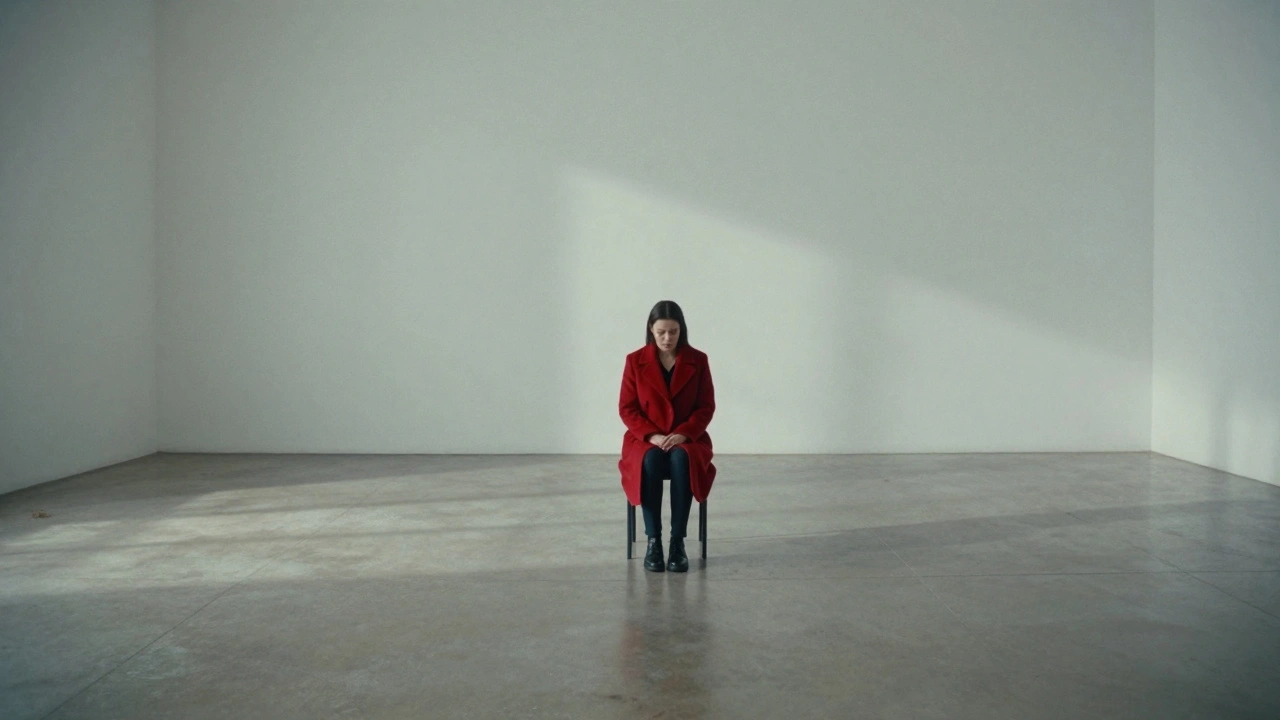
Another powerful tool is the complementary accent. You choose a dominant neutral background (white, black, grey, beige) and introduce one contrasting color. This is high-risk, high-reward. If done poorly, it looks like a bad graphic design choice. If done well, it becomes iconic. Think of the red dress in Schindler’s List. The rest of the world is desaturated; the red carries the weight of humanity and memory.
| Palette Type | Color Composition | Emotional Impact | Best Used For |
|---|---|---|---|
| Monochromatic Cool | Blues, Greys, Whites | Cold, Clinical, Sad, Distant | Dystopias, Hospitals, Thrillers |
| Monochromatic Warm | Browns, Beiges, Creams | Nostalgic, Safe, Stagnant, Old | Period Dramas, Family Sagas |
| High-Contrast Neutral | Black, White, Grey + One Accent | Sharp, Modern, Tense, Focused | Noir, Sci-Fi, Psychological Horror |
| Desaturated Analogous | Muted Greens, Yellows, Browns | Earthy, Uneasy, Natural, Decaying | War Films, Survival Stories |
Texture as a Substitute for Color
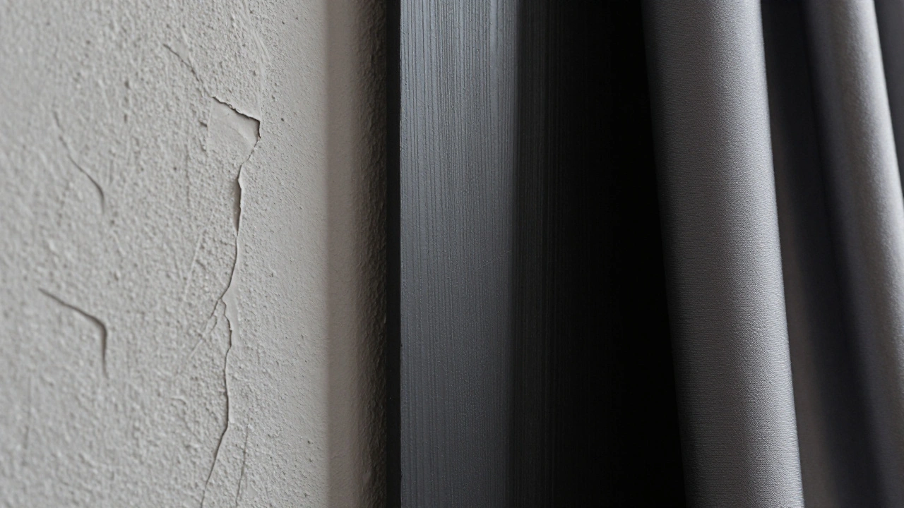
When you remove color variety, you must add textural variety. Otherwise, the image will look flat and boring. Texture provides the 'noise' that keeps the eye engaged. A white wall is boring; a white wall with peeling paint, cracks, and shadow lines is interesting.
Think about materials. Rough burlap reflects light differently than smooth silk. Matte metal absorbs shadows, while polished chrome creates sharp highlights. In a minimalist set, these differences become the primary source of visual interest. You are painting with light and shadow, not just pigment.
Lighting plays a crucial role here. Hard lighting creates strong contrasts between textures, emphasizing the grain of wood or the weave of fabric. Soft lighting flattens textures, which can be useful if you want a dreamlike, ethereal quality. Decide early whether you want your minimalism to feel harsh and real, or soft and abstract.
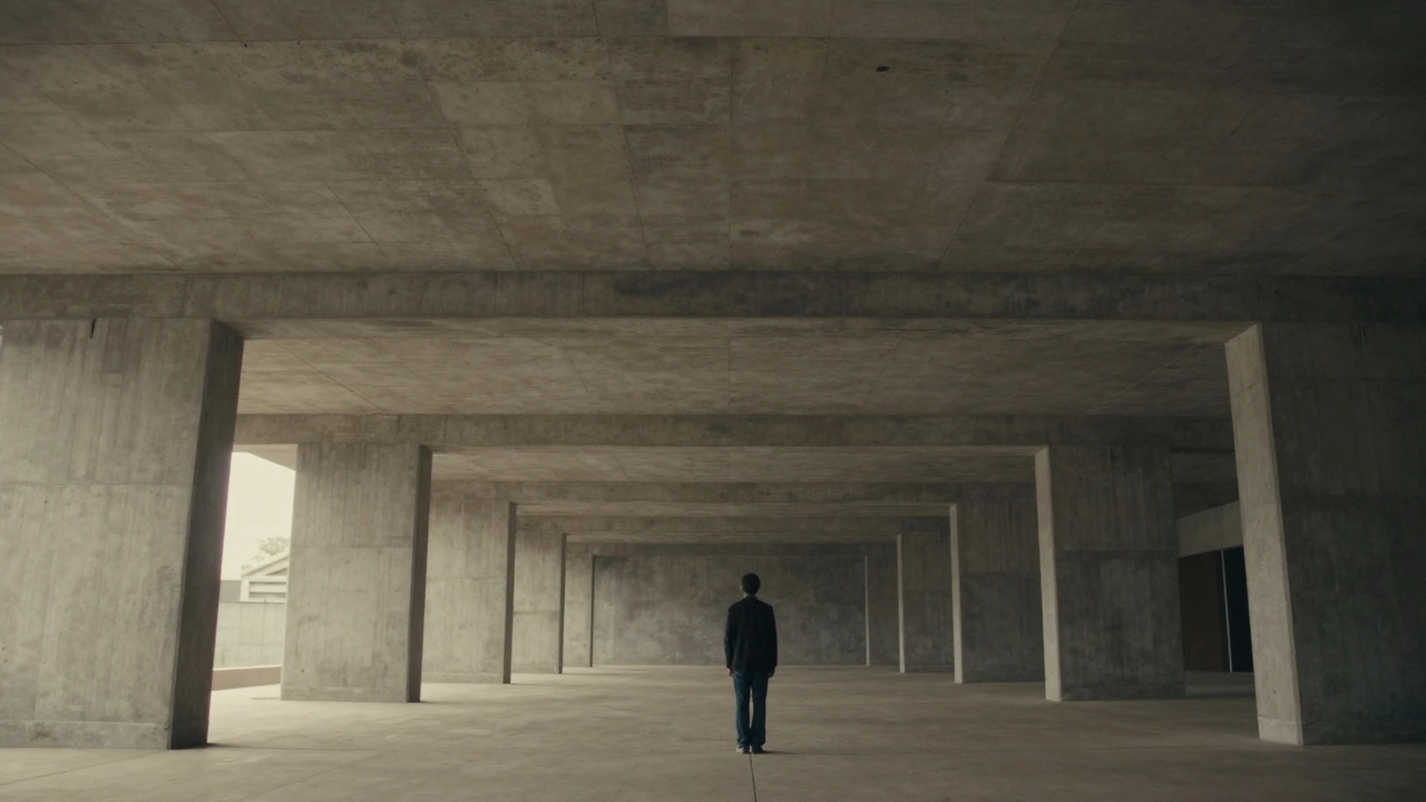
Negative Space and Composition
In traditional set design, empty space is often seen as wasted space. In minimalist design, negative space is an active character. It defines the boundaries of the subject and emphasizes their isolation or importance.
When you place a small object in a large, empty room, you force the audience to ask: "Why is this object here?" The emptiness creates pressure. This technique is heavily used in directors like Andrei Tarkovsky or Wong Kar-wai. They use wide shots with vast amounts of empty space to convey longing, loss, or existential dread.
As a production designer, you must collaborate closely with the director of photography (DP). The framing matters more than the decoration. If the DP plans tight close-ups, you can afford slightly more detail in the immediate vicinity. If they plan wide establishing shots, you need to ensure the negative space works architecturally. Lines, angles, and symmetry become your tools.
Pitfalls to Avoid
Minimalism is easy to mess up. Here are the most common traps that turn 'minimalist' into 'cheap' or 'boring':
- Lack of Depth: Using only flat colors without variation in value (lightness/darkness). Ensure your palette has at least three distinct values to create dimension.
- Over-Cleaning: Real life has dust, wear, and tear. Even in a sterile environment, there should be signs of use. A perfectly clean minimalist set can feel artificial and unrelatable unless that’s the specific point (e.g., a futuristic utopia).
- Igoring Lighting: Assuming the set will look good under any light. Minimalist sets are unforgiving. Poor lighting will reveal every flaw in the construction and texture.
- Forced Simplicity: Removing details because you think it’s 'cool,' rather than because it serves the story. Every missing prop should have a reason.
Practical Steps for Implementation
If you are starting a project with a limited palette, follow this workflow:
- Define the Emotion: Write down the three words that describe the feeling of the scene (e.g., lonely, cold, silent).
- Select Base Colors: Choose one dominant hue and two neutrals. Stick to this strictly.
- Choose Textures: Pick materials that contrast in reflectivity (matte vs. glossy) and roughness.
- Build the Mood Board: Include references from architecture, fashion, and nature, not just other films.
- Test with Light: Photograph your props and materials under different lighting conditions to see how they interact.
Remember, the goal is not to show off your restraint. The goal is to serve the story. If the audience forgets the set because they are so absorbed in the character’s pain, you have succeeded.
What is the difference between minimalist design and low-budget design?
Low-budget design often lacks resources, resulting in accidental emptiness or poor quality materials. Minimalist design is a deliberate artistic choice. It involves high-quality materials, precise lighting, and intentional composition. The key difference is intentionality: every element in a minimalist design is placed there for a specific reason, whereas in low-budget design, elements are often missing due to constraint.
Can I use a limited palette for a comedy?
Yes, but it requires careful handling. Comedies often rely on chaos and energy. A limited palette can work if it creates a stark contrast with the character's behavior. For example, a chaotic character in a sterile, white office can highlight their absurdity. However, avoid overly dark or moody palettes unless it's a dark comedy.
How do I keep a monochromatic scene from looking flat?
Use texture and lighting. Vary the materials so some absorb light (matte fabrics, wood) and others reflect it (metal, glass). Create deep shadows and bright highlights to add dimension. Also, ensure there is a range of values within your chosen hue-from very light tints to very dark shades-to prevent the image from looking like a single block of color.
Which famous films use minimalist production design effectively?
Several notable examples include 2001: A Space Odyssey (clean, geometric whites), Schindler’s List (desaturated tones with strategic color accents), Parasite (use of architectural lines and earth tones to show class structure), and Her (warm, soft pastels to create an intimate, futuristic yet cozy atmosphere).
How does digital post-production affect minimalist design?
Digital grading can enhance a minimalist palette by unifying colors and removing unwanted hues. However, it cannot fix poor physical design. If the set lacks texture or proper lighting, color grading will only make it look muddy. Use post-production to refine and intensify the look established on set, not to create it from scratch.