
Why data belongs in documentaries
Think about the last time you watched a documentary that made you feel something. Maybe it was a heartbreaking look at climate change, or a powerful story about income inequality. Now ask yourself: did numbers make you feel it? Probably not. But what if they had? Data isn’t cold or dry-it’s the hidden heartbeat of real stories. The problem is, most filmmakers treat numbers like background noise. They drop a chart on screen and move on. That’s not storytelling. That’s a slide deck with a voiceover.
Great documentary storytellers don’t just show data-they make you feel it. They turn statistics into human moments. A 2023 study by the Center for Public Integrity found that documentaries using visualized data had 47% higher viewer retention past the 10-minute mark compared to those relying on talking heads alone. Why? Because our brains process images 60,000 times faster than text. When you see a river of red lines showing rising global temperatures over 50 years, you don’t just understand climate change-you sense its weight.
How to turn numbers into emotion
Start by asking: what’s the story behind the number? Not what the number says, but what it costs. A 12% drop in school funding? That’s not a percentage. That’s 300 fewer textbooks in a rural high school. That’s a teacher buying pencils with her own money. Your job isn’t to explain the statistic-it’s to make the viewer see the person behind it.
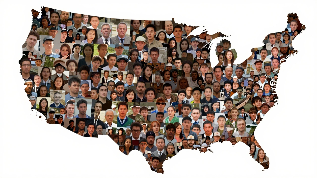
One of the most effective techniques is data personification. Take the U.S. opioid crisis. Instead of saying “over 500,000 deaths since 1999,” show a single line of 500,000 tiny silhouettes marching across the screen-one for each life lost. Each one is identical. Each one matters. The viewer doesn’t just count them-they feel the scale. This technique was used in the 2022 documentary The Last Pill, where each death was represented by a single lit candle. The camera slowly pans across a dark room filled with thousands of flickering flames. No narrator. No music. Just silence and light.
Common techniques that work
There are five data visualization methods that consistently move audiences in documentaries. They’re not fancy. They’re simple. But they’re powerful when used with purpose.
- Animated timelines: Show change over time. A line graph that grows like a tree, branches splitting as new cases emerge. Used in 13th to map the rise of mass incarceration from 1970 to 2015.
- Heat maps with human faces: Overlay population density with crime rates or health outcomes. In The Divide (2021), each dot on a map wasn’t just a location-it was a real person’s face, pulled from archival footage. The more dots, the darker the area. You don’t need to be told the inequality is bad-you see it.
- Scale comparisons: What does $1 billion look like? Stack $100 bills to the ceiling of a school gym. Or fill a swimming pool with pennies. In Money as Debt, a single $100 bill was shown next to a pile of 10,000 bills to represent the national debt per household. The difference was shocking.
- Interactive data points: Even in linear films, you can use motion to reveal data. A map that zooms in on a single town as the narrator says, “This is where it started.” The camera lingers on a house. Then a name. Then a date. You feel the weight of place.
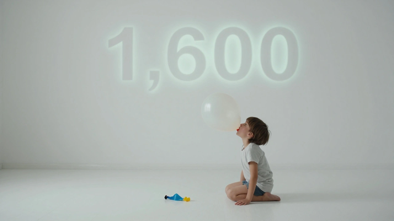
- Minimalist infographics: Avoid clutter. One number. One image. One sentence. The 2024 short film One Breath showed the number of children who die daily from air pollution: 1,600. Then it showed a single child breathing into a balloon. The balloon popped. No music. No words. Just silence.
What not to do
Bad data visualization doesn’t just fail-it distracts. Here are the three most common mistakes filmmakers make:
- Overloading charts: A bar graph with 15 categories? You’re not informing-you’re exhausting. Viewers tune out. Stick to three key data points max. If you have more, break them into separate scenes.
- Using 3D pie charts: They look cool in PowerPoint. They look ridiculous in a documentary. Depth adds nothing. It only confuses. Flat, clean shapes work better. Always.
- Ignoring color psychology: Red doesn’t mean “bad.” It means urgency. Blue doesn’t mean “calm.” It means trust. In Climate of Change (2023), the filmmakers used green for solutions, red for warnings, and gray for inaction. Viewers reacted emotionally to the palette before they even understood the numbers.
Tools filmmakers actually use
You don’t need a team of coders. You don’t need a $50,000 license. Most documentary teams use free or low-cost tools that are surprisingly powerful.
- RawGraphs: Drag and drop your CSV file. Instantly turn it into a custom chart. Export as video or image. Used by independent filmmakers in Kenya and Chile to visualize local health data.
- Flourish.studio: Animated charts, maps, and timelines. Easy to use. Free tier available. Perfect for showing population shifts or economic trends over decades.
- Tableau Public: For deeper analysis. You can link live data to visualizations. Used in The Water War to show real-time reservoir levels across California.
- After Effects + Data-Driven Animation: For custom motion graphics. A single animator can build a data-driven sequence that tells a story in 30 seconds. No code needed.
When data becomes the character
The most memorable documentaries don’t just show data-they give it a voice. In The Algorithm of Justice (2025), the filmmakers didn’t interview judges or lawyers. They let the algorithm speak. Using anonymized court data, they trained a voice model to read out sentencing decisions. The tone was calm. Robotic. Unemotional. As the voice listed case after case, the screen showed the faces of the people sentenced. The contrast was chilling. The algorithm didn’t have malice. But it had consequences. And that’s the point.
When data becomes a character, the viewer stops being a spectator. They become a witness.
Building your own data-driven story
Here’s how to start if you’re making your own documentary:
- Find the human story behind the number. Ask: Who is this affecting? Where? When did it start?
- Collect the data. Use public sources like government portals, WHO, CDC, or local NGOs. Don’t guess. Don’t make it up.
- Choose one visualization method that matches the emotion you want to create. Sadness? Use scale. Anger? Use contrast. Hope? Use change over time.
- Test it. Show your visualization to someone who doesn’t know the topic. Do they feel it? Or do they just shrug?
- Integrate it into the narrative. Don’t just drop it in. Build up to it. Let the story lead. Let the data reveal.
The future is visual
Data visualization in documentaries isn’t a trend. It’s a necessity. As audiences drown in information, they crave meaning. Not more facts. Not louder voices. But clarity. Connection. Humanity.
The next time you sit down to edit your film, don’t ask, “What’s the best chart?” Ask, “What do I want the viewer to feel when they see this number?” Then make the data scream, whisper, or cry. Because numbers without stories are just noise. But stories with data? Those change minds. And sometimes, they change the world.


Comments(7)