You’ve probably felt it before. You’re watching a movie, and you can’t quite put your finger on why a certain scene makes your stomach drop or why the ending feels so triumphant. It’s not just the acting or the score. Often, it’s the colors. They shift subtly from cool blues to warm ambers, guiding your emotions without you even realizing it. This invisible architecture of emotion is built during color script development, a critical pre-production process that maps the emotional journey of a film through its visual palette.
If you think color scripts are just pretty pictures for the art department, you’re missing the point. A color script is a strategic tool. It’s a timeline of color choices that aligns with the narrative beats. Think of it as a musical score, but instead of notes, you have hues. Just as a composer decides when the violins swell and when the drums hit, a production designer and director decide when the screen should feel suffocatingly red or expansively blue. In Asheville, where I live, the autumn foliage provides a natural masterclass in this-how green shifts to gold, then to rust, signaling change. Films do this intentionally, frame by frame.
What Exactly Is a Color Script?
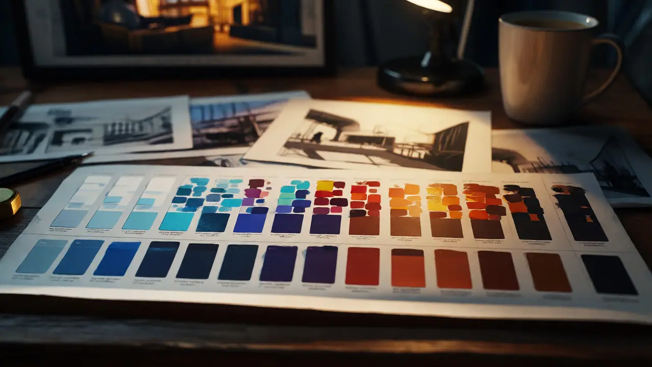
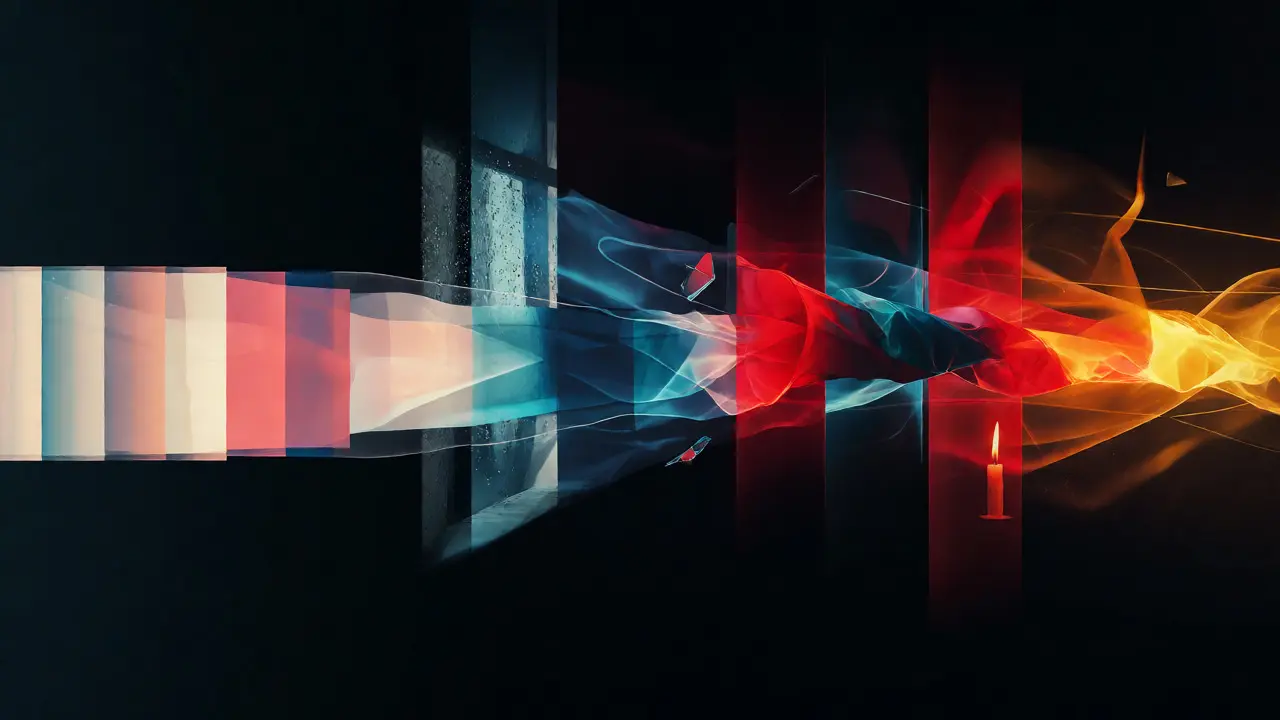
A Color Script is a sequential visualization of a film’s color palette across its entire runtime, used to plan visual continuity and emotional pacing. Unlike a storyboard, which focuses on composition and camera angles, a color script strips away the details to focus solely on hue, saturation, and value. It looks like a series of abstract rectangles or swatches laid out horizontally, representing the progression of scenes from opening credits to the final fade-out.
The concept isn’t new. Walt Disney Studios pioneered this technique in the 1930s for films like Snow White and the Seven Dwarfs. Animators realized that if they didn’t plan the colors, the visuals would become chaotic and emotionally disjointed. Today, while animation still relies heavily on hand-drawn or digital color keys, live-action productions use color scripts to guide lighting, set decoration, and costume design. It’s the blueprint for the film’s visual identity.
Why Your Film Needs a Visual Roadmap
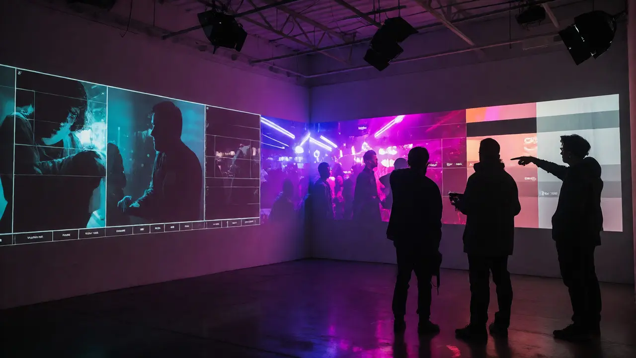
Without a color script, you risk what directors call "visual noise." Imagine a thriller where the protagonist moves from a cold, sterile hospital (blues and whites) to a vibrant, chaotic nightclub (neons and purples), and then back to the hospital. If the transition isn’t planned, the audience might feel confused rather than tense. The color script ensures that every shift has a purpose.
Here are three jobs-to-be-done that a color script completes for a production team:
- Emotional Pacing: It prevents emotional fatigue. If a horror movie stays in dark blacks and grays for two hours, the audience becomes numb. A color script identifies moments to introduce a jarring splash of red or a fleeting hint of yellow to reset the viewer’s attention.
- Continuity Control: It helps the cinematographer and gaffer plan lighting rigs. Knowing that Scene 45 requires a specific teal-orange contrast allows them to prep the right gels and filters in advance, saving money and time on set.
- Narrative Clarity: It reinforces character arcs visually. If a character starts off timid and ends up empowered, their environment’s color palette can evolve from muted pastels to bold primaries, mirroring their internal growth.
The Core Components of Effective Color Scripts
To build a solid color script, you need to understand the three pillars of color theory as they apply to cinema. These aren’t just artistic preferences; they are psychological triggers.
| Element | Definition | Film Application | Psychological Impact |
|---|---|---|---|
| Hue | The basic color family (e.g., Red, Blue). | Determines the primary tone of a scene. | Red = Danger/Passion; Blue = Calm/Sadness. |
| Saturation | The intensity or purity of the color. | High saturation draws eye; low saturation recedes. | Vibrant = Energy/Chaos; Desaturated = Realism/Melancholy. |
| Value | The lightness or darkness of the color. | Controls contrast and visibility. | Dark = Mystery/Fear; Light = Hope/Clarity. |
When developing a script, you don’t just pick colors because they look good together. You choose them based on the scene’s subtext. For instance, in The Grand Budapest Hotel, Wes Anderson uses pastel pinks and purples to create a nostalgic, storybook feel. But notice how the colors desaturate as the war approaches. That’s not an accident; it’s a calculated move in the color script to signal the loss of innocence.
Step-by-Step Guide to Developing a Color Script
So, how do you actually make one? It’s not about painting every frame. It’s about summarizing the essence of each sequence. Here is a practical workflow for production designers and directors.
- Break Down the Script: Divide the screenplay into sequences or acts. Don’t worry about individual shots yet. Focus on major narrative turns. For example, Act 1 might be "The Setup," Act 2A "The Journey," and Act 2B "The Crisis."
- Assign Emotional Keywords: To each sequence, assign 2-3 emotional keywords. If a scene is "Tense," "Claustrophobic," and "Cold," you know you’re leaning toward blues, tight framing, and low-key lighting.
- Create Color Palettes: Select a dominant palette for each sequence. Use tools like Adobe Illustrator or dedicated apps like StudioBinder. Create a strip of 3-5 colors that represent that emotional state. Ensure these palettes contrast with adjacent sequences to create visual rhythm.
- Map the Transitions: Decide how one palette flows into the next. Does the blue slowly bleed into purple? Or does it cut sharply to orange? Sharp cuts create shock; gradual blends create unease or dreaminess.
- Review with Departments: Share the script with the Costume Designer, Set Decorator, and Director of Photography. Ask them: "Does this palette conflict with the wardrobe?" "Can we achieve this lighting budget?" Adjust accordingly.
This process forces collaboration early on. Instead of arguing on set about whether a wall should be beige or gray, you’ve already decided it needs to be a specific shade of taupe to bridge the gap between the hero’s warm home and the villain’s cold lair.
Common Pitfalls in Color Planning
Even experienced teams mess this up. The biggest mistake is over-planning. A color script is a guide, not a straitjacket. If you lock yourself into a rigid palette, you might miss opportunities that arise on location. Maybe you find a location with perfect natural amber light that wasn’t in the plan. Trust the instinct, but check if it breaks the overall arc.
Another trap is ignoring cultural context. Colors mean different things in different cultures. White signifies purity in many Western weddings but mourning in parts of Asia. If your film targets a global audience, ensure your color language translates correctly. Also, avoid "rainbow syndrome." If every scene has a completely different color scheme, the film feels episodic and disconnected. Look for recurring motifs-a specific prop or accent color that appears throughout-to tie it all together.
Real-World Examples of Mastery
Let’s look at how this plays out in iconic films. In Mad Max: Fury Road, the color script is stark. The wasteland is dominated by oranges and teals. This complementary color scheme creates high contrast and visual clarity, essential for fast-paced action. When the setting changes to the Citadel, the palette shifts to cooler grays and metallic tones, signaling a more industrial, oppressive environment.
Contrast that with Her. Spike Jonze uses a warm, soft palette of reds, pinks, and yellows. There are almost no harsh shadows. This creates a sense of intimacy and warmth, reflecting the protagonist’s loneliness but also his desire for connection. The color script here is subtle. It doesn’t shout; it whispers. It supports the theme of artificial love feeling real.
These examples show that there is no single "right" way to develop a color script. It depends entirely on the story you’re telling. A gritty crime drama might use desaturated greens and browns to evoke decay, while a romantic comedy might lean into bright, saturated primaries to evoke joy.
Tools and Resources for Modern Filmmakers
You don’t need a Hollywood budget to start using color scripts. Digital tools have democratized the process. Software like DaVinci Resolve allows you to import rough cuts and apply LUTs (Look-Up Tables) to test color ideas quickly. For pre-production, simple apps like Canva or even PowerPoint can help you lay out your sequences. Some directors prefer physical mood boards, pinning up paint chips and magazine clippings to get a tactile sense of the vibe.
However, remember that technology is just a helper. The core skill is observation. Watch films with the sound off. Try to identify the color shifts. Notice when the screen gets darker or brighter. Notice when the colors become warmer or cooler. Train your eye to see the underlying structure. Once you can spot it, you can replicate it.
Do live-action films really use color scripts?
Yes, absolutely. While they originated in animation, live-action directors and production designers use color scripts extensively. They serve as a communication tool for the DP, gaffer, and set decorators to ensure visual consistency and emotional alignment throughout the shoot.
How detailed should a color script be?
It varies by project size. For a feature film, it might cover every sequence with broad palettes. For a short film or music video, it might be more granular. The key is to capture the emotional beat of each section, not necessarily every single shot.
Can a color script change during production?
Definitely. Pre-production plans are hypotheses. On set, weather, location constraints, or actor performances might require adjustments. The color script is a living document that guides decisions but adapts to reality.
What software is best for creating color scripts?
Adobe Photoshop and Illustrator are industry standards for precision. However, simpler tools like Procreate on iPad, Canva, or even spreadsheet software work well for initial concepts. The tool matters less than the strategic thinking behind it.
How does color grading relate to the color script?
The color script is the plan; color grading is the execution. During post-production, the colorist uses the script as a reference to adjust the footage, ensuring the final image matches the intended emotional journey established in pre-production.