Think about the last time a movie made you feel something before a single word was spoken. Maybe it was the cold blue of a spaceship drifting through space, or the warm amber glow of a kitchen at dusk. Those colors weren’t just there for looks-they were speaking to you. In cinema, color isn’t decoration. It’s dialogue. It’s mood. It’s the unspoken script that guides how you feel before the characters even open their mouths.
Why Color Matters More Than You Think
Every frame in a film is carefully built-not just by lighting and composition, but by color. Directors and cinematographers don’t pick colors randomly. They choose them because they know how the human brain reacts to them. Red doesn’t just mean danger. It means passion, urgency, violence, love-all at once. Blue doesn’t just mean calm. It can mean isolation, sadness, or even cold logic.
Take color psychology in film. It’s not a new idea. Think of Stanley Kubrick’s The Shining. The Overlook Hotel is filled with red carpets, red doors, and red walls. That’s not an accident. Red triggers anxiety, blood, and hidden violence. It makes you feel uneasy even before anything scary happens. Or consider Amélie, where greens and reds swirl together like candy. That film doesn’t just look pretty-it feels joyful, whimsical, alive. The colors are the emotion.
Modern films use color grading as a storytelling tool. It’s not just about fixing exposure. It’s about rewiring how you feel. A scene shot in natural light can become haunting just by shifting the white balance toward teal. A sunset can turn from romantic to ominous by pulling out the yellows and letting the purples dominate.
Red: Power, Danger, and Desire
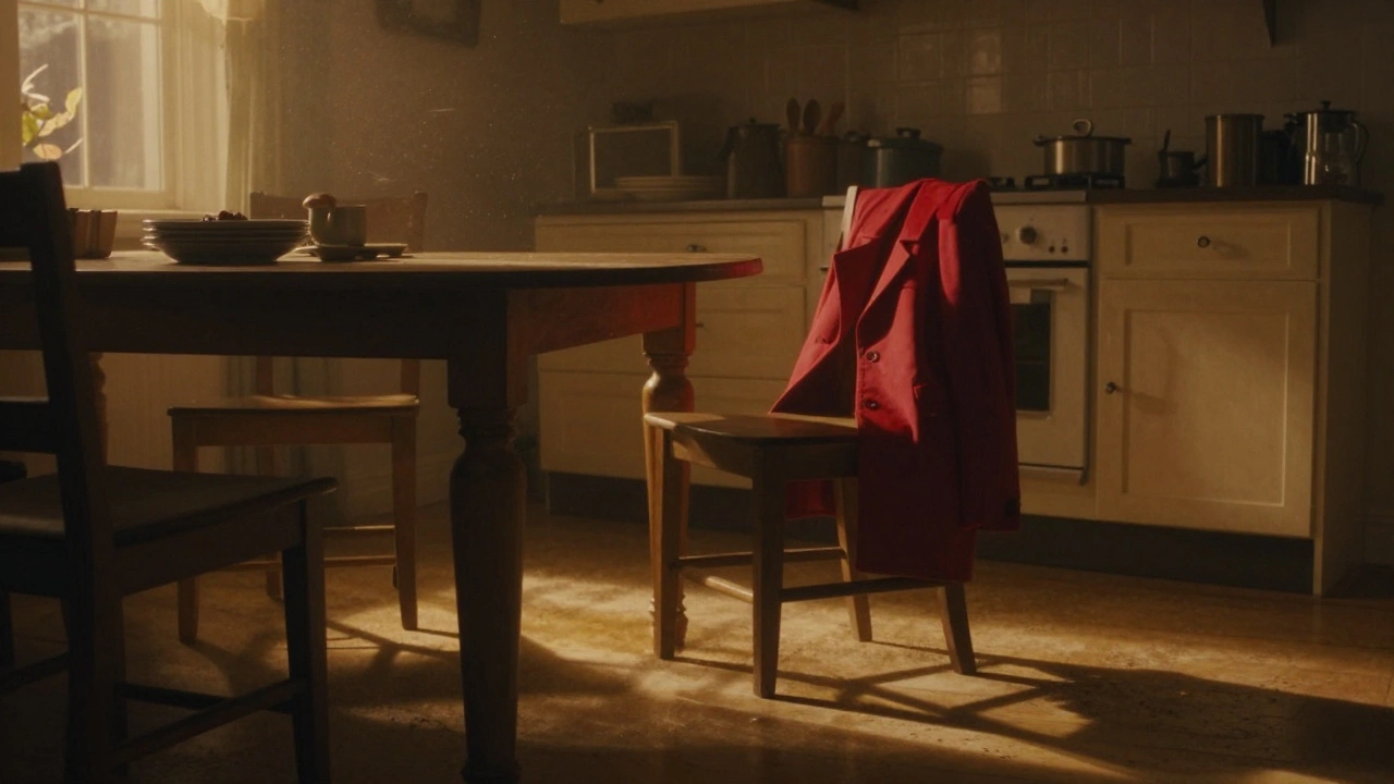
Red is the most emotionally charged color in film. It’s used to signal intensity. In Schindler’s List, the only splash of color in the entire black-and-white film is the red coat of a little girl. That single frame haunts the viewer because red screams: this is important. This is loss.
James Cameron’s Avatar uses red sparingly but powerfully. The RDA’s military gear and weapons are all red-signaling aggression, control, and industrial destruction. Meanwhile, the Na’vi’s skin tones and environment are blues and greens, representing harmony with nature. The contrast isn’t subtle. It’s a visual war.
Red also means desire. In The Godfather, the red lighting in the baptism scene contrasts with the violence happening off-screen. The color tells you: this is sacred, this is sacred, and yet-blood is flowing. You feel the tension because your brain reads red as danger, even when the scene looks peaceful.
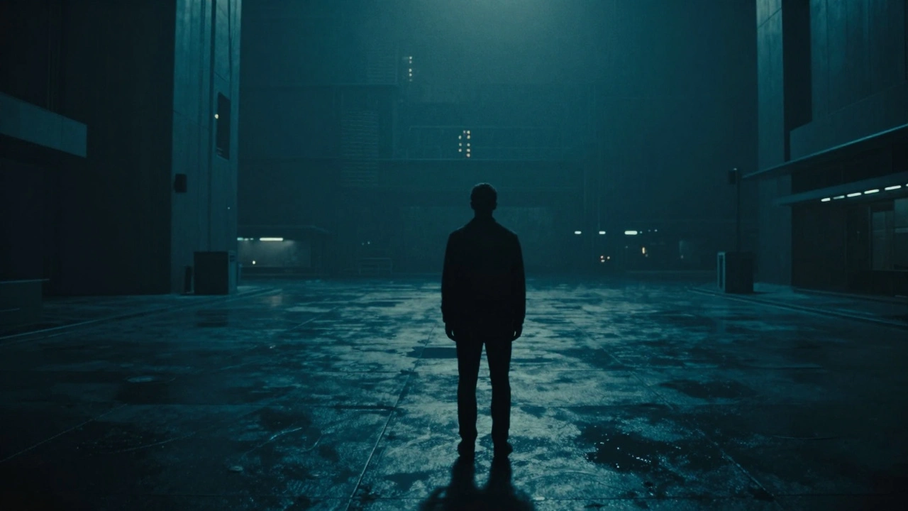
Blue: Isolation, Calm, and Cold Truth
Blue is the most common color in modern cinema-not because it’s pretty, but because it’s emotionally neutral. It’s the color of distance. Think of Blade Runner 2049. Almost every interior scene is bathed in blue. The world feels empty, silent, lonely. The protagonist, K, moves through spaces that don’t respond to him. The blue isn’t just lighting-it’s emotional texture.
Blue also signals truth. In The Matrix, the real world is washed in cold blue tones. The simulated world? Green. Blue means reality. Green means illusion. You don’t need dialogue to understand that.
But blue isn’t always sad. In Amélie, blue skies and blue clothing create a sense of gentle wonder. In La La Land, blue is used during dream sequences to show hope and longing. Context matters. Blue can mean peace-or it can mean abandonment. It depends on what’s around it.
Yellow: Hope, Madness, and Warning
Yellow is the trickiest color in film. It can mean sunshine, joy, optimism. Or it can mean decay, sickness, madness. In The Sixth Sense, yellow appears everywhere-doorknobs, envelopes, a child’s shirt. It’s not a coincidence. The color is the film’s visual clue: something is wrong. Something is hidden.
In Breaking Bad, the yellow Hazmat suits worn by Walter White become a symbol of his transformation. Yellow isn’t just the color of the suit-it’s the color of his moral decay. It’s the color of poison. It’s the color of something once pure now tainted.
Even in animated films, yellow carries weight. In Inside Out, Joy is yellow. But she’s not just happy-she’s the force trying to hold everything together. Yellow here isn’t childish. It’s fragile. It’s the color of someone holding back tears while smiling.
Green: Nature, Envy, and the Unnatural
Green is the color of life. But in film, it’s rarely used for simple beauty. More often, it’s used to show something off-kilter. In The Matrix, green is the color of the digital world-the code that runs everything. It’s artificial. It’s not real. It’s the color of simulation.
In Hereditary, green is everywhere: the walls, the trees, the lighting. It doesn’t feel natural. It feels sickly. It makes you feel watched. Green here isn’t nature-it’s something twisting nature.
Green also means envy. In Parasite, the rich family’s home is filled with green plants and green-tinted windows. It’s not just wealth-it’s something cold, distant, and slightly toxic. The green doesn’t welcome you. It separates you.
Even in sci-fi, green signals danger. In Alien, the ship’s interior lighting is dim and greenish. It’s not just practical-it’s biological. You feel like you’re inside a living thing. Something breathing. Something waiting.
Black and White: Contrast, Memory, and Time
Even when films use color, black and white still has power. In The Artist, the lack of color isn’t a limitation-it’s a choice. It makes you focus on movement, expression, silence. It feels like a memory.
Black and white isn’t just nostalgia. It’s emotional stripping. In Schindler’s List, the red coat stands out because everything else is gone. The absence of color makes the one color scream.
Modern films mix black and white with color to show shifts in time or perception. In Sin City, almost everything is grayscale-except blood, lips, and neon signs. The color isn’t added for style. It’s added to show what matters. What’s alive. What’s dangerous. What’s real.
How Filmmakers Plan Color Before Shooting
Color isn’t decided in post-production. It starts on day one. Production designers pick paint colors for sets. Costume designers choose fabrics based on how they’ll look under specific lighting. Cinematographers test lenses and filters to see how colors will shift.
For Mad Max: Fury Road, the team created a color palette before filming even began. They used three dominant tones: orange (desert), green (toxic water), and white (dust). Every costume, vehicle, and prop was chosen to fit within that system. Even the sky was painted with color gels to match the mood.
Some directors use color scripts-storyboard-like sequences that map out color changes scene by scene. In Little Women, Greta Gerwig used different color palettes for each sister. Jo’s scenes are warm browns and reds-energetic, bold. Beth’s are soft blues and creams-gentle, fading. You don’t need dialogue to understand their personalities.
What Happens When Color Breaks the Rules
Great films don’t just follow color rules-they break them on purpose. In Her, the world is full of warm pinks and oranges. It’s cozy, intimate, almost too perfect. But the main character is lonely. The color doesn’t match his emotion. That’s the point. The film is saying: this world looks happy, but it’s hollow.
In Parasite, the wealthy family’s house is bright, clean, and full of natural light. The basement is dark, damp, and cold. The color contrast isn’t just visual-it’s social. The rich live in color. The poor live in shadow. The film doesn’t need to say it. The colors do.
When color breaks expectation, it forces you to pay attention. It makes you question what you’re seeing. That’s the power of film color. It’s not about beauty. It’s about truth.
What You Can Learn From Watching Color
You don’t need to be a filmmaker to use color psychology. Watch movies with your eyes open. Notice what colors dominate a scene. Ask yourself: why this color? What does it make me feel? Does it match the character’s emotion-or contradict it?
Try this: rewatch a scene from your favorite movie with the sound off. Just watch the colors. Do they pull you in? Push you away? Make you tense? Calm you down? That’s the language of film.
Color doesn’t just show you what’s happening. It tells you how to feel about it. And that’s why, in cinema, color isn’t just seen. It’s felt.
How do filmmakers decide which colors to use in a movie?
They start with the story and mood. Directors and cinematographers create color scripts-visual maps that assign specific hues to scenes based on emotion, time of day, or character arcs. They test lighting, fabric, and paint under real conditions to ensure the colors work together. For example, a scene about grief might use cool grays and blues, while a moment of revelation might shift to warm golds.
Can color in film influence how audiences remember a movie?
Absolutely. Color creates emotional anchors. Think of the red coat in Schindler’s List or the green of The Matrix. These colors become symbols. Years later, people don’t just remember the plot-they remember the feeling tied to that color. That’s why iconic films often have signature palettes.
Is color grading the same as color correction?
No. Color correction fixes technical issues-like making skin tones look natural or balancing exposure. Color grading is artistic. It’s about mood. A director might ask the colorist to make a scene feel colder, dreamier, or more claustrophobic. That’s not about accuracy-it’s about emotion.
Why do so many sci-fi movies use blue and teal?
Blue and teal suggest technology, coldness, and artificial environments. They contrast with warm human tones, making characters feel isolated. It’s also a practical choice: these colors work well with digital effects and lighting setups. But more than that, they evoke the unknown-space, machines, the future. That’s why you see them in Blade Runner, Ex Machina, and Arrival.
Do cultural differences affect how color is used in film?
Yes, but filmmakers often use universal emotional responses. Red means danger or passion in most cultures. Blue suggests calm or sadness. Yellow can mean warning. While some meanings vary (like white for mourning in parts of Asia), most film color choices rely on deep, cross-cultural psychological reactions. That’s why a Western audience and an Asian audience can both feel dread from a red-lit room.


Comments(6)