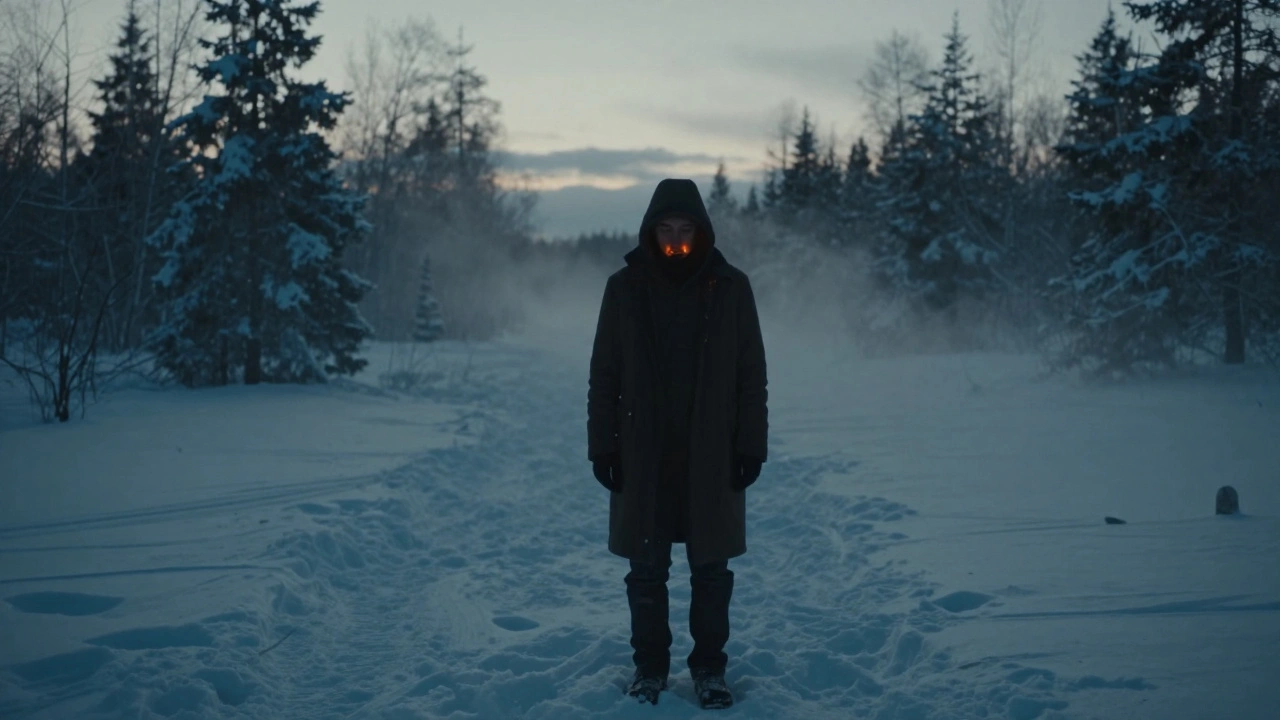
Every frame of a movie tells a story-but the colors in that frame? They tell the audience how to feel. A cold blue tone can make a scene feel lonely. A warm golden glow can turn a simple kitchen into a memory. This isn’t magic. It’s color grading, and it’s the final, powerful step in shaping how a film looks and feels. If you’ve ever watched a movie and thought, Why does this feel so different from the last one?, the answer isn’t just the script or the acting. It’s the color.
What Color Grading Actually Does
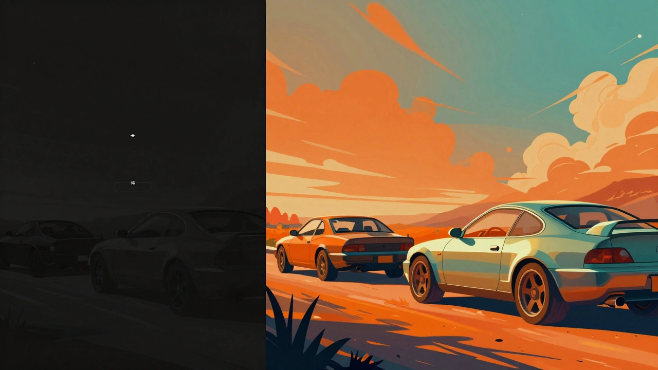
Color grading isn’t just making things look prettier. It’s not the same as color correction, though people mix them up all the time. Color correction fixes exposure, white balance, and skin tones so everything looks natural. Color grading takes that corrected footage and bends it to match the director’s mood. It’s the difference between a scene that’s just properly lit and one that feels like it’s breathing.
Think of it like music. You can have perfect pitch and timing-that’s correction. But then you add reverb, distortion, or a slow fade-that’s grading. It gives emotion. A horror film might crush the shadows, pull out all the greens, and leave only sickly yellows. A romantic drama might soften highlights, push warmth into the midtones, and mute the blues so nothing distracts from the characters’ faces.
Modern films don’t rely on film stock anymore. Digital cameras capture everything in flat, low-contrast LOG profiles so they hold maximum detail. That means the raw footage looks dull, almost lifeless. Color grading brings it back to life. Without it, most digital films would look like bad TV news footage.
The Digital Workflow: From Camera to Final Frame
Color grading doesn’t happen in a vacuum. It’s the last stop in a long digital pipeline. Here’s how it fits:
- Shoot: Cameras record in LOG or RAW formats to preserve dynamic range. No one shoots in standard Rec.709 anymore-it’s too limiting.
- Logistics: Footage gets copied, backed up, and organized. Metadata like scene, take, and camera settings are tagged. If this step is messy, grading becomes a nightmare.
- Color Correction: Technicians fix exposure issues, match shots from different cameras, and normalize skin tones. This is where consistency is born.
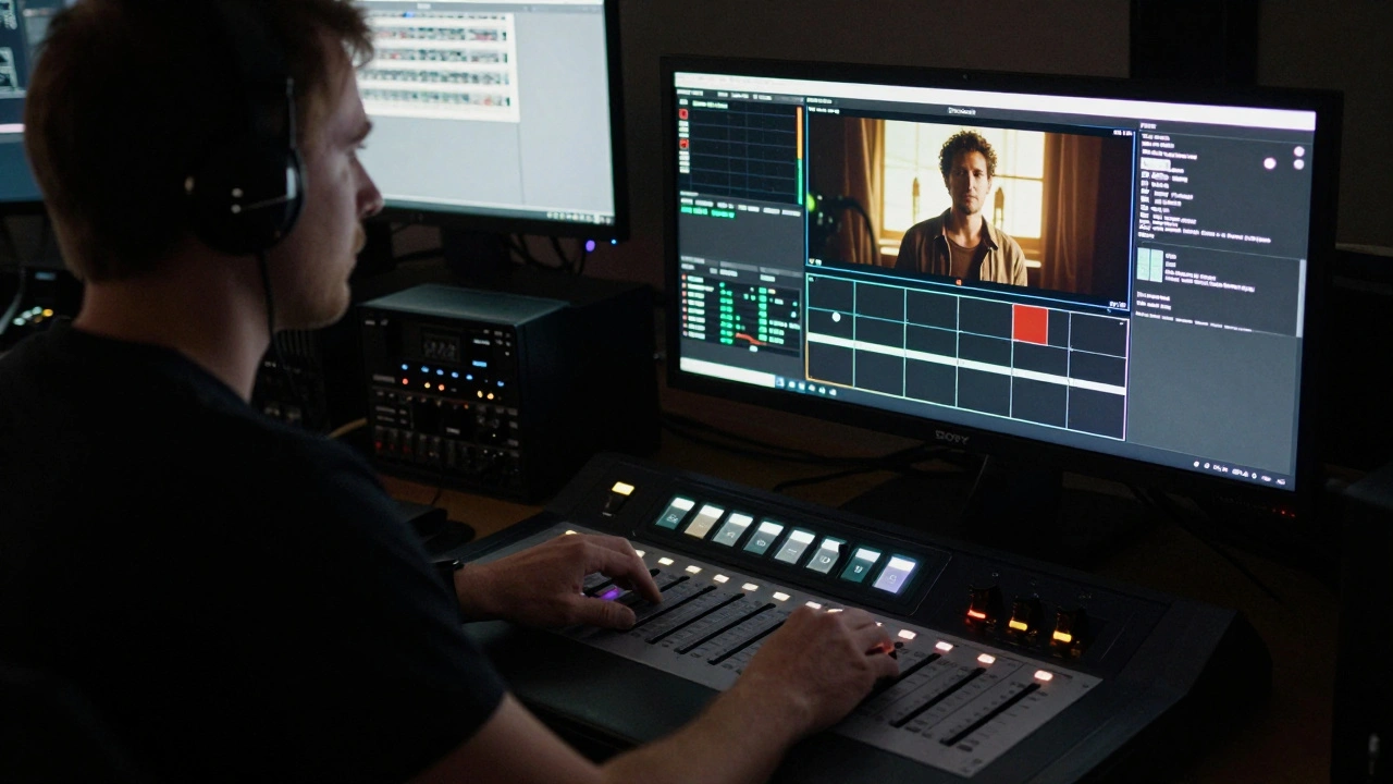
- Grading: The colorist opens the graded version in DaVinci Resolve, Baselight, or Adobe Premiere Pro. They start with primary adjustments: lift, gamma, gain. Then they move to secondary tools-isolating skies, skin, or specific colors to tweak independently.
- Delivery: Final grade is rendered into the target format: DCI-P3 for theaters, Rec.2020 for 4K streaming, or sRGB for YouTube.
Each step depends on the last. If the color correction is sloppy, the grading will look patchy. If the footage isn’t properly labeled, the colorist spends hours hunting for the right take. A clean workflow isn’t just efficient-it’s creative.
Tools of the Trade: What Professionals Use
There’s no single tool that rules them all, but a few dominate the industry:
- DaVinci Resolve: The industry standard. Originally a hardware-only system from the 1980s, now it’s free software that does editing, grading, VFX, and audio. Its node-based system lets colorists build complex grades like a flowchart. Most Netflix originals are graded in Resolve.
- Baselight: Used on big studio films. More expensive, more precise. Used on Avengers: Endgame and Dune. Its color science is built for high-end cinema.
- Adobe Premiere Pro: Popular for indie filmmakers and TV. Its Lumetri panel is powerful enough for most projects. Not as deep as Resolve, but faster if you’re editing and grading in the same place.
Hardware matters too. Colorists work on calibrated monitors-like the Sony BVM-X300 or Dell UltraSharp UP3218K-set to DCI-P3 or Rec.709 color spaces. They use control surfaces with physical sliders and wheels. No mouse. No trackpad. Just hands on dials, turning shadows up or down like a volume knob.
Real-World Examples: How Color Shapes Emotion
Look at The Revenant. Almost every outdoor scene has a cold, blue-gray palette. The firelight is the only warm color-and it’s barely there. That’s not an accident. The colorist wanted the audience to feel the freezing, brutal isolation of the wilderness. The color wasn’t just applied-it was designed to make viewers shiver.
Contrast that with Mad Max: Fury Road. The whole film is drenched in orange and teal. The sky is burnt orange, the sand is rust-red, and the vehicles are coated in metallic teal. It’s hyper-saturated, almost cartoonish. But it works because the color isn’t realistic-it’s mythic. It turns a post-apocalyptic chase into a visual legend.
Even TV shows use color to signal shifts in tone. In Stranger Things, Season 1 uses heavy magenta and cyan to evoke 80s nostalgia. Season 3 shifts to bright, saturated neon-reflecting the era’s consumerism and the show’s growing stakes. The color grading isn’t decoration. It’s storytelling.
Pitfalls to Avoid
Color grading is powerful, but it’s easy to ruin a film with it. Here are the top mistakes:
- Overdoing it: Too much saturation or contrast turns a film into a meme. A grade should enhance, not scream.
- Ignoring skin tones: If a character’s face looks wrong, the audience disconnects. No amount of cool blue skies fixes a greenish nose.
- Not matching shots: If one scene is warm and the next is icy, viewers get whiplash. Consistency is king.
- Grading on the wrong monitor: If your screen is too bright or uncalibrated, you’ll push shadows too dark or highlights too blown. Always grade on a known, calibrated display.
- Waiting too long: Grading should start during editing. If you wait until the final cut, you’ll have to fix mismatched shots that can’t be fixed.
One rule of thumb: if you can see the grade, it’s too strong. The best color grading is invisible. You don’t notice it-you just feel it.
How to Start Learning Color Grading
You don’t need a $100,000 system to learn. Here’s how to begin:
- Download DaVinci Resolve for free. It’s the full version, no watermarks.
- Find free LOG footage online. Search for “free RED or ARRI LOG footage” on sites like Pixabay or Artgrid.
- Apply a basic grade: lift the shadows, boost the midtones slightly, add a touch of warmth. Compare it to the original.
- Watch YouTube tutorials from professionals like Casey Faris or Julian Bagg. They break down real films shot by shot.
- Grade a short film you shot. Even if it’s just 30 seconds, do it from start to finish. You’ll learn more in one project than ten hours of watching.
Don’t chase trends. Don’t try to make your video look like the latest Netflix show. Learn the principles: contrast, color harmony, emotional intent. Then find your own voice.
Color Grading Is the Silent Language of Film
Most viewers won’t know the word “color grading.” They won’t know what a LUT is or why a scene looks different on their phone versus their TV. But they’ll feel it. They’ll sit in silence during a quiet moment because the color made it feel sacred. They’ll lean forward in their seat during a chase because the reds made it feel urgent.
Color grading doesn’t just change the look of a film. It changes how the story lives inside the viewer. It’s not a technical step. It’s the final brushstroke on a painting that’s already been made. And in digital filmmaking today, that brushstroke is everything.
Is color grading the same as color correction?
No. Color correction fixes technical problems-exposure, white balance, mismatched shots-so everything looks natural and consistent. Color grading is artistic. It changes the mood, tone, and emotion of a scene by adjusting colors in a stylized way. Correction makes it look right. Grading makes it feel right.
Can I do professional color grading on a regular laptop?
Yes, but with limits. DaVinci Resolve runs on most modern laptops, but grading 4K LOG footage is demanding. You’ll need at least 16GB of RAM, a decent GPU (NVIDIA RTX or AMD Radeon Pro), and a calibrated monitor. For serious work, a dedicated grading station with a control surface is ideal. But for learning or indie projects, a good laptop and a decent screen are enough to start.
Why do films look different on streaming vs. theaters?
Because they’re graded for different displays. Theaters use DCI-P3 color space and high-brightness projectors. Streaming platforms like Netflix or Apple TV use Rec.2020 or HDR10, which have wider color ranges but lower peak brightness. A film graded for theaters might look dull on a phone if not re-graded for HDR. Professional workflows now include multiple deliverables-each one graded specifically for its platform.
Do I need to shoot in LOG to do good color grading?
Not always, but it helps a lot. LOG profiles capture more dynamic range-details in shadows and highlights-that you can recover during grading. If you shoot in standard Rec.709, you’re locked into a narrow range. You can still grade it, but you won’t have the flexibility to fix underexposed or blown-out areas. For serious work, LOG is standard. For casual projects, it’s optional.
What’s a LUT, and do I need one?
A LUT (Look-Up Table) is a preset that maps one color value to another. It’s like a filter you apply to quickly change the look of footage. Many filmmakers use LUTs to simulate film stocks or match a director’s vision. But LUTs aren’t magic. They’re starting points. A good colorist uses LUTs to save time, then manually tweaks them to fit the scene. Never apply a LUT and call it done.


Comments(6)