Writing a screenplay isn’t just about telling a great story. If your script doesn’t look like a real movie script, producers won’t even read past the first page. That’s not harsh-it’s reality. The industry has clear, non-negotiable rules for how a script should look. These aren’t arbitrary. They exist so readers can focus on the story, not the formatting. A messy script screams amateur. A clean one says, "I know what I’m doing."
Why Script Formatting Matters
Think of screenplay formatting like a uniform. You don’t need to wear a tuxedo to a job interview, but you do need to look professional. Same with scripts. A producer might read 50 scripts in a week. If one looks off-wrong margins, weird fonts, inconsistent spacing-they’ll assume the writer doesn’t respect the craft. It’s not about being rigid. It’s about communication.
Standard formatting ensures every reader-agent, producer, director, actor-can instantly understand what they’re looking at. They know exactly where the scene heading is. They know when dialogue starts. They know when a character speaks off-screen. No guessing. No confusion. Just flow.
Core Elements of a Proper Screenplay
Every screenplay has seven basic parts, and they all have fixed rules.
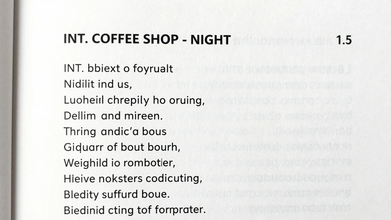
- Scene Headings (also called sluglines): These tell you where and when the scene takes place. Format: INT. or EXT. followed by location and time. Example: INT. COFFEE SHOP - NIGHT. No extra words. No punctuation after the time. Always in uppercase.
- Action Lines: These describe what’s happening on screen. Keep them short. One or two sentences max. Avoid novel-style descriptions. No internal monologues. Show, don’t tell. Example: JANE slams the door. A glass shatters on the floor.
- Character Names: When a character speaks, their name appears centered, 3.7 inches from the left margin. All caps. No periods. No parentheses unless it’s a parenthetical.
- Dialogue: This sits below the character name, indented 2.5 inches from the left and 1.5 inches from the right. Never italicize. Never bold. Just clean text.
- Parentetheticals: These are brief direction for how a line is delivered. Only use when absolutely necessary. Example: (whispering). Put them right under the character name, in parentheses. Don’t overuse them. Let the dialogue carry the emotion.
- Transitions: These are rare. Only use them at scene breaks. Examples: CUT TO:, FADE IN:, FADE OUT:. Write them flush right. Don’t use “SMASH CUT” or “DISSOLVE TO.” Those are outdated.
- Page Numbers: Always on the top right, starting from page 1. No cover page. No title page. Just the script, with the title centered on page 1.
Font, Margins, and Spacing
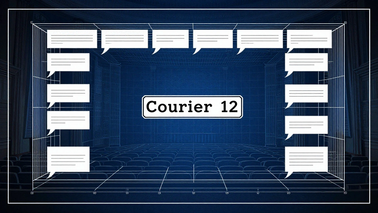
The font is non-negotiable: Courier 12. Always. Why? Because one page of Courier 12 equals roughly one minute of screen time. That’s the industry standard. If you use Times New Roman, your 90-page script will look like a 70-page script. Producers notice.
Margins matter too:
- Left margin: 1.5 inches (for binding)
- Right margin: 1 inch
- Top margin: 1 inch
- Bottom margin: 1 inch
Line spacing? Single space between lines. Double space between scenes. No extra blank lines unless you’re breaking a scene. Don’t add space after dialogue unless it’s followed by a transition.

Common Mistakes Writers Make
Even experienced writers slip up. Here are the top five mistakes that get scripts tossed:
- Using the wrong font - Times New Roman, Arial, Calibri. Nope. Courier 12 is the only acceptable font.
- Overwriting action lines - Writing paragraphs of description. Keep it tight. One line per visual beat.
- Overusing parentheticals - Every line with “(angrily)” or “(smiling)” kills momentum. Trust the actor. Trust the reader.
- Incorrect capitalization - Character names in lowercase? Dialogue in italics? These are red flags.
- Too many transitions - CUT TO: every scene? It’s 2026. You’re not editing film on a Moviola. Only use transitions when they serve the story.
Tools That Help
You don’t have to do this by hand. There are tools built for this.
- Final Draft - The industry standard. Costs money, but it auto-formats everything. Perfect for professionals.
- WriterDuet - Free version available. Real-time collaboration. Great for co-writers.
- Highland 2 - Clean, distraction-free. Uses plain text but auto-formats to industry specs. Works on Mac.
- Slugline - Web-based. No download. Good for beginners.
Even if you use these tools, learn the rules. Don’t just rely on the software. If you hand a script to a producer and it’s misformatted, they’ll assume you didn’t even try.
How to Check Your Script
Before you send it out, run these checks:
- Is every scene heading in caps? INT./EXT. + location + time?
- Are character names centered and in caps?
- Is dialogue indented correctly? 2.5 left, 1.5 right?
- Is the font Courier 12? Not 11.5. Not 12.5. Exactly 12.
- Are page numbers in the top right? Starting from page 1?
- Are transitions used only at scene breaks?
- Are action lines under 5 lines each?
Print it out. Read it like a producer would. If you catch yourself thinking, "Hmm, this looks off," fix it. Trust your gut.
What Happens When You Get It Right
When your script looks professional, something shifts. Readers breathe easier. They start to focus on your story. Your dialogue lands. Your characters feel real. Your pacing clicks.
There’s a reason every major studio, production company, and agency uses the same template. It’s not tradition. It’s efficiency. It’s respect. You’re not asking for permission to be creative. You’re showing you understand the language of cinema.
Great writing deserves a clean frame. Your script isn’t a poem. It’s a blueprint. And blueprints need to be exact.
Do I need to use Final Draft to write a professional screenplay?
No. Final Draft is popular, but it’s not required. Many successful screenwriters use WriterDuet, Highland 2, or even plain text editors with formatting plugins. What matters is that your script follows industry standards: Courier 12 font, correct margins, proper spacing. The tool doesn’t make you professional-your formatting does.
Can I use bold or italics in a screenplay?
No. Bold and italics are not part of standard screenplay formatting. They’re distractions. If a line needs emphasis, rewrite it so the emotion comes through the dialogue or action. If a character’s name is important, use the standard capitalization. If a sound is critical, write it in ALL CAPS in the action line-like THUNDER CRACKS. That’s the only exception.
How many pages should a screenplay be?
For feature films, 90 to 120 pages is the standard range. A 90-page script runs about 90 minutes. A 120-page script runs about two hours. Anything under 80 pages is usually considered too short for a feature unless it’s experimental. Anything over 130 pages is hard to sell unless you’re an established writer. TV scripts vary: half-hours are 22-27 pages, hours are 45-55.
Should I include camera directions in my script?
Generally, no. Screenplays are blueprints for the story, not the shoot. Don’t write "ZOOM IN ON HER FACE" or "LOW ANGLE SHOT." That’s the director’s job. Stick to what’s visible on screen: actions, expressions, sounds. If a visual choice is crucial to the story-like a character seeing something off-screen-describe the effect, not the camera. Example: She stares at the window. Her reflection is gone. That’s enough.
Is it okay to write in present tense?
Yes. Screenplays are always written in present tense. Even if the story flashes back, you describe it as if it’s happening now. Example: He opens the drawer. Inside is a gun. This creates immediacy. Past tense feels like narration, not action. Never use "He opened" or "She had left." Stick to present.


Comments(8)