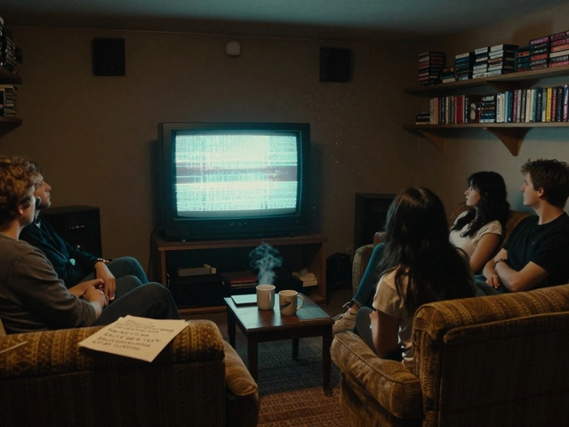
Ever stare at a single comic panel and wonder how it becomes a full scene in a movie? It’s not just about moving the characters from paper to screen. It’s about breathing life into static images-adding motion, rhythm, sound, and emotion that the original art only hints at. Translating comic panels into cinematic sequences isn’t a copy-paste job. It’s a rewrite in a different language. One where silence speaks, where timing is everything, and where every frame must earn its place.
Understanding the Language of Comics
Comics don’t tell stories with motion. They tell them with compression. A single panel can show a character’s entire emotional arc in a glance: the tilt of the head, the crinkle of the brow, the way a fist clenches just enough to hint at rage. Artists use panel layout, line weight, and negative space to control pace. A splash page slows you down. A grid of small panels rushes you forward. The reader’s eye becomes the editor.
But film doesn’t work like that. In cinema, time is linear and controlled by the director, not the viewer. You can’t pause and linger on a detail unless the camera holds on it. So when adapting a comic, the first question isn’t what to show-it’s how long to show it.
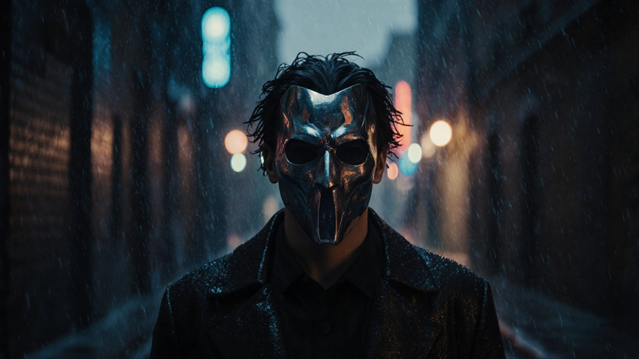
Take the famous panel from Watchmen where Rorschach walks through rain, his mask reflecting city lights. In the comic, it’s one image, silent, haunting. In the film, that moment becomes 18 seconds of slow motion, raindrops hitting his mask in sync with a ticking clock, the score swelling just beneath the noise of the storm. The emotion stays the same. The delivery changes completely.
Breaking Down the Panel: What to Keep, What to Expand
Not every panel deserves a cinematic treatment. Some are mood pieces. Others are plot points. The trick is identifying which ones carry narrative weight-and which are just flavor.
Start by asking:
- Does this panel introduce a character’s motivation?
- Does it reveal a hidden truth?
- Does it trigger the next major event?
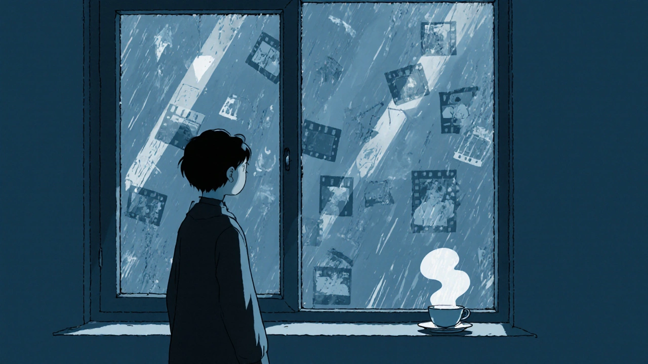
If the answer is yes, it’s a candidate for expansion. A simple panel of a character staring out a window? In the comic, it’s a glance. In the film, it becomes a tracking shot through a rain-streaked glass, reflections of past memories flickering in the glass, a faint voiceover from an old recording playing in the background. The emotion is the same-but now it’s layered.
Conversely, a panel showing a generic crowd scene? In the comic, it’s a background texture. In the film, it’s often cut entirely-or replaced with a single wide shot that implies the same scale without wasting screen time.
Timing Is Everything: From Static to Flow
Comics rely on the reader’s imagination to fill the space between panels. That gap-the gutter-is where the story happens. Film has no gutter. Every moment must be shown. That’s why pacing is the biggest challenge.
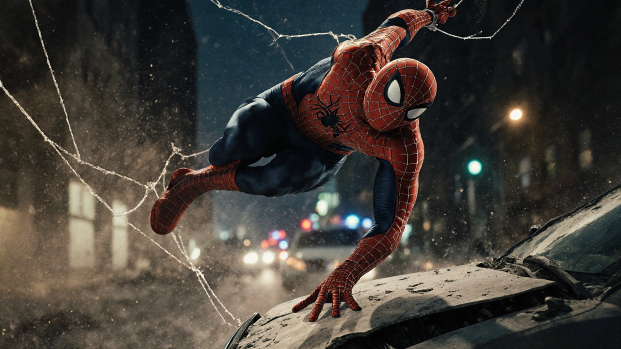
Consider a fight sequence from Spider-Man. In the original comic, a 12-panel sequence might show Spidey dodging, swinging, landing a punch, then flipping over a car-all in 30 seconds of reading time. The reader’s mind stitches it together. In the film, that same sequence takes 90 seconds. Why? Because you need to see the weight of the punch, the spray of concrete dust, the way Spidey’s web-line snaps taut before he swings away.
Good adaptations don’t just stretch time-they recompose it. Directors use cuts, slow motion, and sound design to mimic the rhythm of comic pacing. Think of the way Scott Pilgrim vs. the World uses visual effects to mimic comic book motion lines, speed bursts, and onomatopoeia. It doesn’t copy the panels. It translates their energy.
Sound Design: The Unseen Panel
Comics are silent. But films are full of noise. That silence in a comic panel? In film, it becomes a choice: do you fill it with silence, or with something unexpected?
In Persepolis, the animated adaptation of Marjane Satrapi’s graphic novel, entire scenes play out with no music. Just footsteps, distant sirens, the clink of a teacup. That silence mirrors the stark black-and-white art of the original. The absence of sound becomes part of the storytelling.
Contrast that with The Dark Knight. When the Joker slides a knife across a man’s cheek, the comic shows it in two panels: the blade, then the blood. The film? The sound of the blade scraping skin is amplified. Then-complete silence. Then a single drop of blood hits the floor. That pause? That’s the gutter. The filmmakers built it out of air.
Camera as the Reader’s Eye
In comics, the reader controls where they look. In film, the camera does. That’s why camera movement is one of the most powerful tools in adaptation.
When adapting a panel where a character is standing alone in a room, the director has choices:
- Hold the shot steady-emphasizing isolation
- Slowly zoom in-revealing a hidden object on the table
- Pan across the room-showing the chaos left behind
Each choice changes the meaning. In Batman: Year One, the film adaptation uses a low-angle dolly shot to follow Batman as he walks through a dark alley. The camera doesn’t just show him-it makes you feel the weight of the city pressing down. That’s not in the comic. But it’s exactly what the comic feels like.
Color, Lighting, and Mood: Beyond the Ink
Comic artists use color sparingly. Often, it’s just black, white, and a few accent tones. Films have the whole spectrum. And that’s where tone gets rebuilt.
In Ghost World, the comic uses muted grays and browns to reflect the protagonist’s apathy. The film? It uses desaturated colors too-but adds a cold blue tint to every exterior shot. The lighting makes the world feel hollow. That’s not in the original panels. But it’s the visual equivalent of the character’s inner emptiness.
On the other hand, Scott Pilgrim explodes with color-neon pinks, electric blues-matching the hyper-stylized art of the comic. The film doesn’t just adapt the story. It adapts the aesthetic.
When Adaptation Fails: What Not to Do
The worst adaptations treat comics like storyboards. They recreate panels shot-for-shot. The result? Lifeless. Flat. Like watching a slideshow with sound.
Remember the 2003 Daredevil movie? There’s a scene where Daredevil leaps from a rooftop. In the comic, it’s one bold splash panel-dramatic, clean, powerful. In the movie? The camera spins around him in slow motion while he yells. It’s not cinematic. It’s cartoonish.
Good adaptation doesn’t replicate. It resonates. It takes the soul of the comic and rebuilds it in a new body.
Tools of the Trade: How Professionals Do It
Studio teams use a process called panel mapping. They break down every page into:
- Key emotional beats
- Visual motifs
- Sound cues
- Pacing rhythm
Then they create a shot list that doesn’t follow the panels-it follows the story’s heartbeat. A single comic panel might become five shots in the film. Or a whole sequence might be condensed into one.
Writers and directors often work with storyboard artists who aren’t just drawing scenes-they’re translating. They ask: What does this moment feel like? Not what it looks like.
Final Thought: It’s Not About the Panels. It’s About the Feeling.
The best comic-to-film adaptations don’t win because they’re faithful. They win because they feel true.
Whether it’s the quiet despair in Persepolis, the chaotic joy of Scott Pilgrim, or the grim weight of Watchmen, the goal isn’t to recreate the page. It’s to recreate the experience of reading it.
So when you look at a comic panel and think, How do I turn this into a movie?-don’t think about camera angles. Don’t think about lighting rigs. Think about how the reader felt when they saw it. Then make the audience feel that same thing-just with sound, motion, and time.
Can any comic be adapted into a film?
Technically, yes-but not every comic should be. Comics with strong visual storytelling, emotional depth, and clear character arcs adapt best. Experimental or abstract comics often lose their meaning when forced into linear film structure. The key is whether the story can survive without relying on the unique rhythm of the page.
Do I need to use the original artist’s style in the film?
No. The film’s visual style should serve the story, not mimic the comic. Some adaptations, like Spider-Man: Into the Spider-Verse, embrace the comic’s look with cel-shading and halftone dots. Others, like 100 Bullets, use gritty realism to match the tone. The goal isn’t replication-it’s emotional accuracy.
How do you handle text-heavy comic panels?
Voiceover is the most common tool, but it’s risky. Overuse makes it feel like a narration. Better options: show the character writing the letter, use subtitles with visual context, or cut the text entirely and replace it with a visual metaphor. In Blankets, long journal entries become animated sketches that unfold as the character speaks-keeping the emotion without the clutter.
What’s the biggest mistake in comic adaptations?
Trying to include every panel. Comics are dense. Films need space. The most successful adaptations cut 60-70% of the source material. What remains isn’t the panels-it’s the core emotional truth. If you’re trying to satisfy every fan’s favorite moment, you’ll lose the story.
Do I need permission to adapt a comic into a film?
Yes. Comic stories are protected by copyright. Even if you’re making a short film or student project, you need rights from the publisher or creator. Unauthorized adaptations can be taken down-or lead to legal action. Always secure licensing before production begins.


Comments(7)