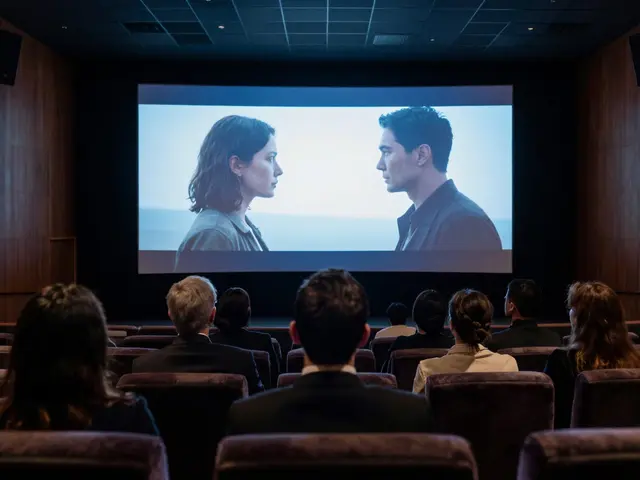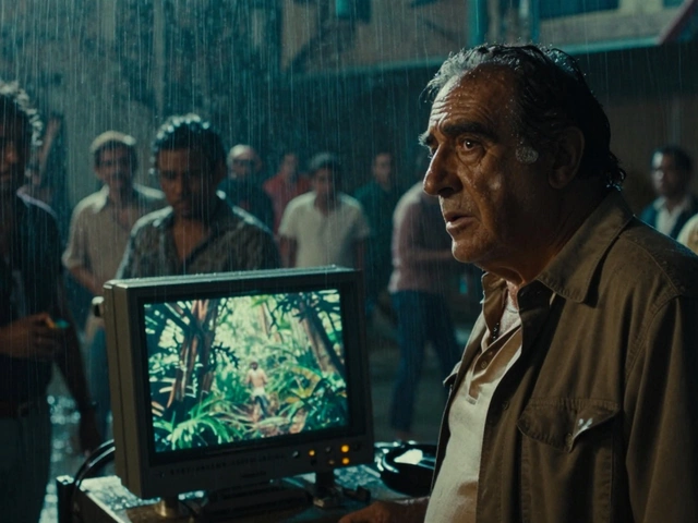
Ever watched a movie where the colors felt off? Maybe the shadows were too blue, or the skin tones looked waxy. That’s usually where cinematography meets color grading. These two disciplines don’t just make images pretty; they tell you how to feel before a single line of dialogue is spoken. If you’ve ever wondered why a thriller feels cold and a romance feels warm, you’re looking at the interplay between light capture and post-production manipulation.
The core problem for most creators isn’t knowing *what* looks good-it’s knowing *how* to get there consistently. You need a system that bridges the gap between what your camera records and what the audience perceives. This guide breaks down that bridge, moving from the physics of light on set to the digital curves in post-production.
Key Takeaways
- Cinematography captures the raw emotional data of a scene through lighting and composition.
- Color Grading refines that data, establishing the final tonal palette and narrative mood.
- Logarithmic profiles (like S-Log or V-Log) preserve dynamic range but require significant grading effort.
- White balance is not just a technical setting; it’s a creative tool for controlling warmth and coolness.
- Consistency across shots is more important than individual shot beauty when building a cohesive visual style.
Understanding the Division of Labor
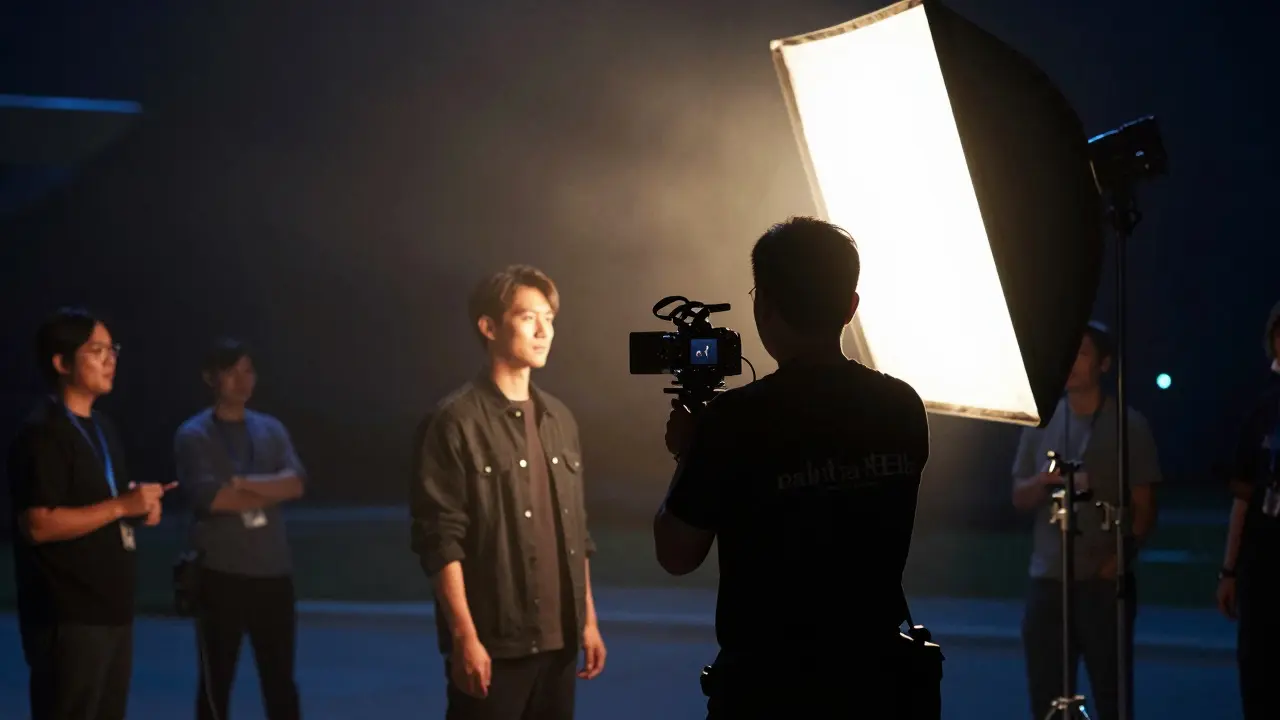
Many people confuse Cinematography with Color Grading, treating them as interchangeable steps. In reality, they are distinct phases with different goals. Cinematography is the art of capturing light. It involves choosing lenses, managing exposure, and designing lighting setups to create depth and dimension. Think of it as painting with photons. The Director of Photography (DP) decides if a face should be lit from the side to create mystery or from the front to reveal clarity.
Color grading happens later, in post-production. Here, the Colorist takes the flat, often desaturated image captured by the camera and applies the final look. This is where you adjust hue, saturation, and luminance to match the director’s vision. While the DP creates the structure, the Colorist adds the texture. A great grade enhances the cinematography; a bad one fights against it.
The Role of Light and White Balance
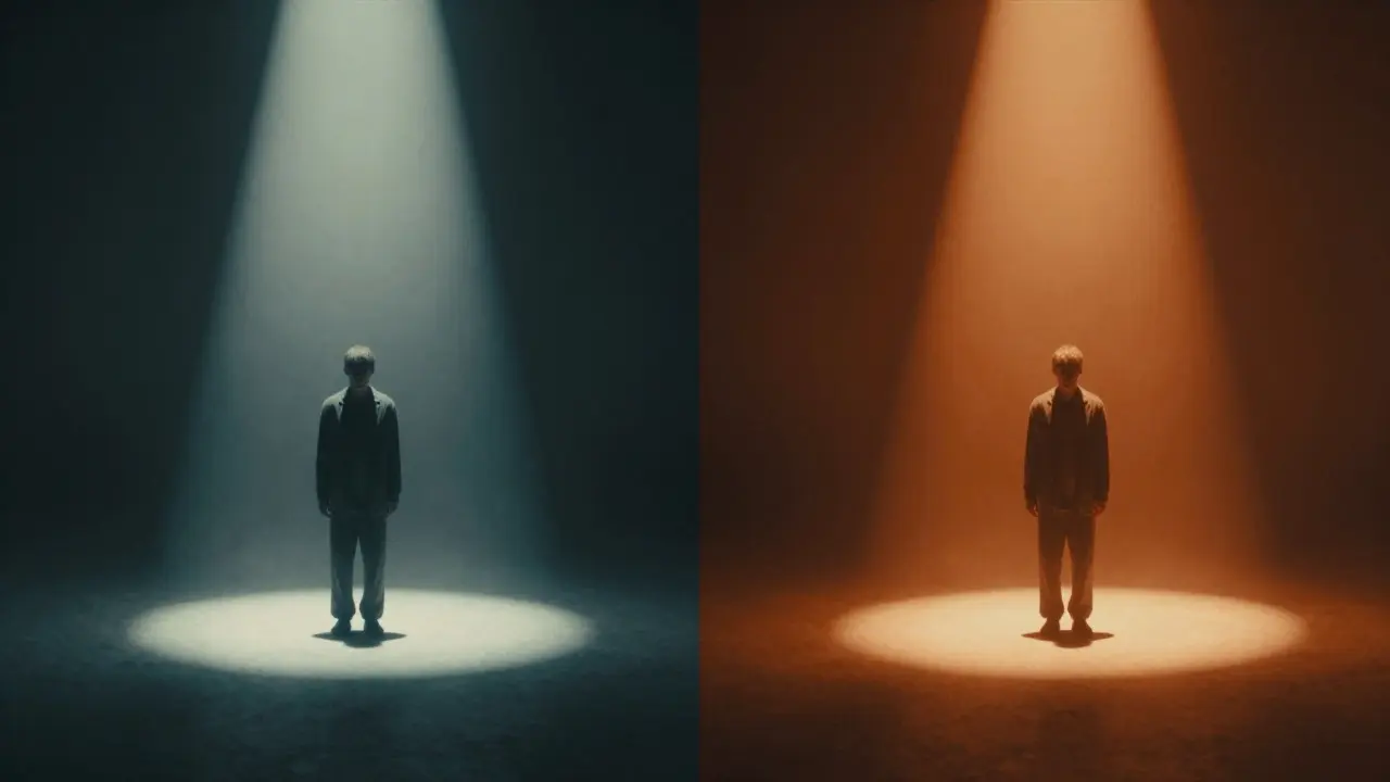
Before you touch a slider in software, you must understand light temperature. Measured in Kelvin, this scale dictates whether a scene feels warm (yellow/orange) or cool (blue). Lower Kelvin values (around 3000K) mimic candlelight or sunset, evoking intimacy or nostalgia. Higher values (5600K and above) resemble daylight or overcast skies, suggesting neutrality or clinical sterility.
In Digital Cinema, you have two main ways to handle this: shooting in RGB (Rec.709) or Log. Shooting in Rec.709 gives you an image that looks correct immediately on screen. It’s convenient for quick reviews but limits your flexibility in post. If you expose incorrectly, you have little room to recover highlights or shadows.
Shooting in Log, however, is the industry standard for serious productions. Log files record a wider range of brightness levels. They look flat and gray on set because they prioritize data retention over immediate aesthetics. This flatness is actually a feature. It allows you to shift white balance dramatically in post without introducing banding or noise. For example, if you shoot a night scene under moonlight but want it to feel like a warm indoor conversation, Log footage lets you pull the white balance warmer without blowing out the highlights.

Building a Palette: Hue, Saturation, and Luminance
Once you have your base image, you start shaping the style using three primary axes: Hue, Saturation, and Luminance. These aren’t just knobs to turn randomly; they form a semantic language.
- Hue: The actual color itself. Shifting greens toward teal is a classic technique to make skin tones pop. This is known as complementary color theory. Warm oranges contrast sharply with cool teals, creating visual tension that draws the eye.
- Saturation: The intensity of the color. Desaturating an image can make it feel bleak, timeless, or documentary-like. Increasing saturation makes it vibrant, energetic, or surreal.
- Luminance: The brightness. Adjusting midtones affects the overall mood. Darker midtones create shadow and mystery; brighter midtones create openness and optimism.
A common mistake is relying too heavily on saturation. Beginners often crank up the saturation to make colors "pop," resulting in an unnatural, hyper-real look. Instead, focus on luminance contrast first. Establishing strong blacks and whites gives the image weight. Then, use hue shifts to guide the viewer’s attention, and finally, adjust saturation to taste.
Practical Workflow: From Set to Screen
How do you actually execute this? The process follows a logical sequence that ensures efficiency and consistency.
- On-Set Monitoring: Use a waveform monitor or vectorscope. Don’t trust your eyes alone. Check that highlights aren’t clipping (hitting pure white) and shadows aren’t crushing (hitting pure black). Keep your key faces within a safe exposure range.
- Dailies Review: Watch the footage the next day. Look for continuity errors. Did the sky change color between shots? Is the actor’s skin tone consistent? Note these issues before starting the grade.
- Primary Correction: In your grading software (like DaVinci Resolve), fix the technical issues first. Balance the white point, adjust the black level, and ensure the image matches the intended exposure. This is called "balancing."
- Secondary Grading: Now, apply the creative look. Use power windows to isolate specific areas (like a character’s face or a background element) and adjust them independently. This is where you add the "style."
- Final Polish: Add grain if needed to mask digital artifacts, check for flicker, and export in the correct color space for delivery (usually DCI-P3 for cinema or Rec.709 for broadcast).
Common Pitfalls and How to Avoid Them
Even experienced filmmakers fall into traps that undermine their visual style. Recognizing these early saves hours of rework.
Over-grading: The urge to make every frame look like a poster is dangerous. If the grade distracts from the story, it’s too much. Step back. Does the image support the emotion, or does it compete with it?
Inconsistent Lighting: If you shoot a scene with mixed light sources (e.g., tungsten indoors and daylight outside) without gelling or balancing, the grade will struggle to unify them. Plan your lighting ratios carefully on set. It’s harder to fix mismatched color temperatures in post than it is to gel a window.
Ignoring Skin Tones: Human faces are the focal point in most narratives. If skin tones look green or purple, the audience subconsciously rejects the image. Always protect skin tones during global adjustments. Use secondary masks to keep faces neutral while you push the background colors.
Tools of the Trade
You don’t need the most expensive gear to achieve professional results, but you do need the right tools. Here’s a comparison of essential equipment and software options.
| Tool Type | Entry-Level Option | Professional Standard | Key Benefit |
|---|---|---|---|
| Software | DaVinci Resolve (Free) | DaVinci Resolve Studio / Baselight | Industry-standard node-based workflow |
| Monitor | Calibrated IPS Laptop Screen | Baselight Reference Monitor | Accurate color reproduction |
| Camera Profile | Standard/Rec.709 | Log/S-Log/V-Log | Maximum dynamic range retention |
| Lighting Control | LED Panels | HMIs/Tungsten Mix | Precise color temperature control |
Note that while DaVinci Resolve is the dominant force in grading, Adobe Premiere Pro and Final Cut Pro also offer robust color wheels. However, for complex projects requiring multi-node workflows, dedicated grading suites remain superior.
Frequently Asked Questions
What is the difference between color correction and color grading?
Color correction is the technical process of fixing exposure, white balance, and contrast to make the image look natural. Color grading is the artistic process of applying a specific mood or style to the corrected image. You always correct before you grade.
Do I need to shoot in Log to get a good cinematic look?
Not necessarily. If you have controlled lighting and accurate exposure, you can achieve a great look from Rec.709 footage. However, Log provides more flexibility for extreme dynamic ranges and dramatic white balance shifts, making it safer for unpredictable conditions.
How important is a calibrated monitor for color grading?
Extremely important. An uncalibrated monitor may display colors inaccurately, leading to grades that look wrong on other screens. A hardware-calibrated reference monitor ensures that what you see is what the audience will see, especially for critical deliverables like cinema or broadcast.
Can I grade video on a laptop?
Yes, but with caveats. Laptops have smaller screens and less color accuracy. For short-form content or social media, it’s acceptable. For long-form features or commercial work, a large, calibrated external monitor is strongly recommended to avoid inconsistencies.
What is the best color palette for horror movies?
There is no single rule, but horror often uses desaturated palettes with high contrast. Cool blues and greens in shadows create unease, while stark, isolated lights (like a flashlight beam) create tension. Avoid overly warm or saturated colors unless they serve a specific narrative purpose, like a false sense of safety.