
Think about the opening scene of The Grand Budapest Hotel. You see perfectly symmetrical buildings, pastel colors, and a layout that feels almost staged. It doesn't look like reality; it looks like a painting. That isn't an accident. The director, Wes Anderson, builds his movies using the exact same tools as a painter uses a brush. When you watch a great movie, you aren't just watching actors move around. You are seeing how visual art has been translated into moving images.
Cinema and fine art share the same DNA. Both rely on light, shadow, color, and space. But in the past twenty years, filmmakers have gotten more intentional about borrowing directly from art history. They hire painters to consult on scripts. They study old canvases to decide where to put a lamp in a room. This article breaks down exactly how those decisions happen. We will look at specific techniques, legendary directors who worked with artists, and why understanding this connection changes how you watch every film.
How Painters Frame the Screen
Every shot in a movie is a static image before it starts moving. That means the photographer, or cinematographer, has to decide how to arrange elements inside that frame. They often turn to classic painting rules to do this. The most famous rule is the Rule of Thirds. You might know this from photography school. It suggests placing important objects along invisible lines that divide the picture into thirds.
But go deeper than that. Renaissance painters like Leonardo da Vinci studied geometry to create balance. Modern directors use these same geometric patterns to guide your eyes. If a character stands slightly off-center but near a doorway that creates a leading line, your eye follows that path naturally. This is called composition. It makes a scene feel "right" even if you can’t explain why.
Stanley Kubrick was famous for obsessing over composition. He would plan his shots down to the millimeter, often studying architectural blueprints and paintings before filming began. In films like Barry Lyndon, Kubrick placed characters low in the frame, surrounded by tall ceilings and vast corridors. This made them look small and isolated. It mimicked the scale found in many Baroque landscape paintings.
Color Theory on Set
Color isn’t just decoration. It carries meaning. In the world of production design, color theory is a science. A red wall might signal danger. A green tint might suggest sickness or envy. These associations come straight from art psychology. Production designers often choose palettes based on famous art movements rather than random preferences.
Take the French Impressionist movement. Artists like Monet focused on light and fleeting moments. Their paintings often feature soft blues, greens, and yellows. A filmmaker wanting to capture a dreamy, nostalgic memory might mimic this palette. They will ask the camera crew to shoot during “Golden Hour”-just after sunrise or sunset. Then they grade the footage in post-production to match the saturation levels found in an oil painting.
Conversely, a horror movie might lean into Expressionism. German Expressionist films from the 1920s used sharp angles and jagged shadows to show mental instability. Today’s thriller directors borrow those stark contrasts. They paint the walls black and place a single spotlight on the actor. This technique forces the audience to focus entirely on the face and expression, ignoring the rest of the room.
The Architecture of Story
Buildings tell stories, too. Sometimes the location itself acts as a character. Production designers don’t just build a fake house; they construct a world that reflects the protagonist’s inner life. This is where sculpture and architecture overlap with filmmaking.
If a character is stuck in the past, the designer might fill the room with heavy Victorian furniture and cluttered shelves. It creates visual weight. If the character wants freedom, the room might be open-plan with glass walls and minimal decor. This approach draws heavily from the Bauhaus movement of the 1920s. Bauhaus emphasized function over form, clean lines, and industrial materials.
| Art Movement | Key Visual Traits | Film Example |
|---|---|---|
| Bauhaus | Minimalism, Clean Lines, Industrial Materials | Metropolis (1927) |
| Surrealism | Dream Logic, Mismatched Objects, Melting Forms | Eternal Sunshine of the Spotless Mind (2004) |
| Renaissance | Symmetry, Balanced Proportions, Classical Light | The Lion King (Animated sequences) |
| Expressionism | Jagged Shadows, Distorted Perspectives, High Contrast | Mindhunter (TV Series) |
| Pop Art | Bright Colors, Bold Outlines, Repetitive Patterns | Cruel Intentions (1999) |
Notice the diversity in that list. Each movement offers a different visual language. Filmmakers treat these languages as tools. If they want to make you feel confused, they reach for Surrealism. If they want to show order and control, they look to the Renaissance.
When Directors Hire Actual Artists
Sometimes, the connection goes beyond just copying a style. Some directors bring professional painters onto the set to work alongside them. This practice was rare in Hollywood until recently, but it changed everything when it started happening.
In the 1980s, David Lynch, the creator of Twin Peaks, collaborated with surrealist photographers. He wanted the scenes to feel like they existed outside of normal time. To achieve this, he avoided standard studio lighting. Instead, he let natural light and ambient glow define the mood. It gave the show a hazy, oil-painting texture that still defines the genre today.
Tim Burton is another big proponent. His aesthetic mirrors the works of Edward Gorey and other dark illustrators. When building the set for Edward Scissorhands, the design team created the castle to look like an illustration come to life. The jagged edges and the overwhelming contrast between the pink suburb and the gray castle were deliberate choices based on graphic design principles.
More recently, in 2019, the movie Jojo Rabbit used pop art visuals inspired by 1970s comic books. The bright, flat colors stood in stark contrast to the dark subject matter of World War II. This technique, often called ironic juxtaposition, forces the viewer to think critically about what they are seeing. It challenges the passive viewing experience by making the image stand out stylistically.
Lighting as Brushstrokes
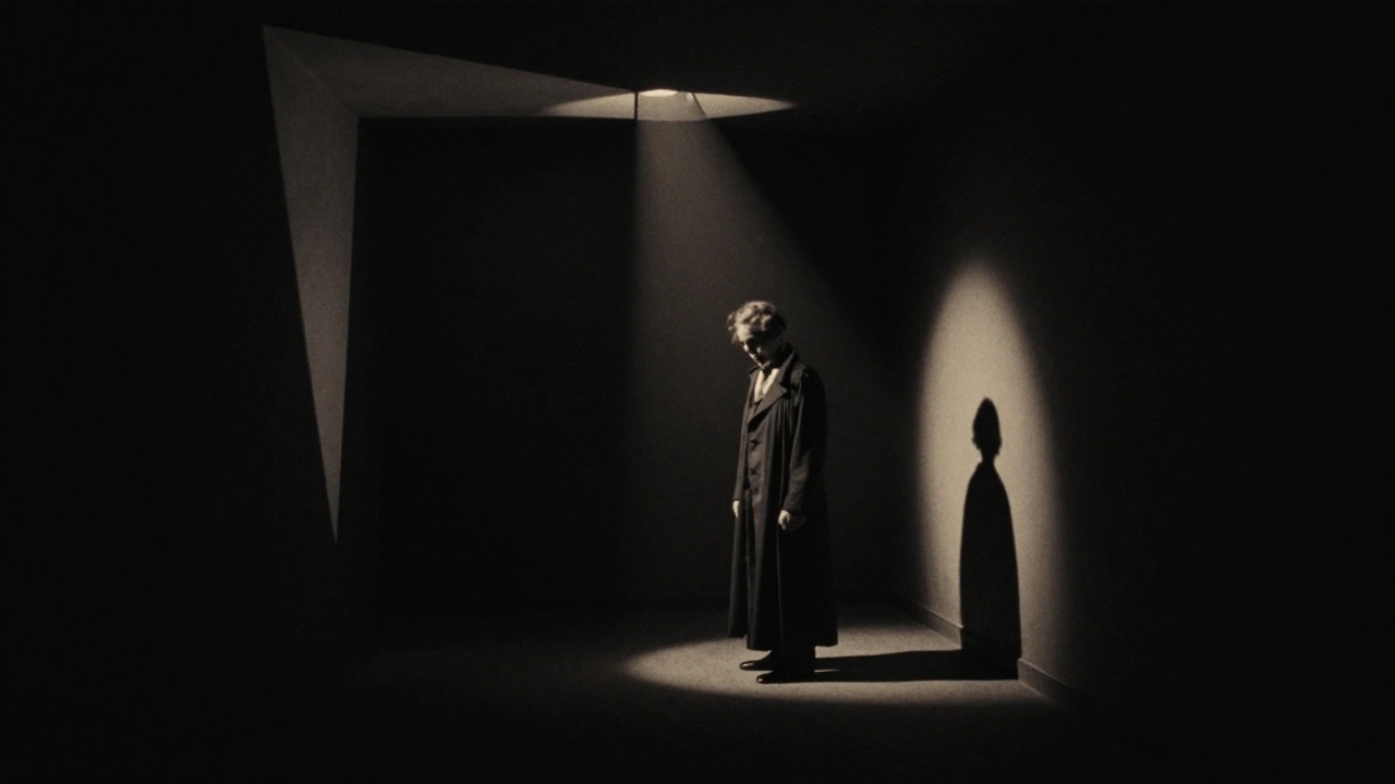
Lighting is arguably the most direct translation of art into film. In the days of silent movies, cinematographers were literally painting with light. They used a technique called Chiaroscuro a technique used in arts which is characterized by strong tonal contrasts and dramatic effects of lighting.. This term comes directly from Italian painters of the seventeenth century.
Think of Caravaggio. His paintings feature deep blacks and blinding highlights. Faces emerge from the darkness. Cinematographers replicate this effect by using high-contrast lighting setups. They don’t flood the room with light. They leave corners in shadow. This adds mystery. It tells the audience that something is hidden.
In modern cinema, digital technology allows us to manipulate light in ways painters couldn’t. However, the principle remains the same. The goal is emotional impact. Soft, diffused lighting usually signals safety or romance. Harsh, directional lighting signals conflict or threat. Every lighting setup is a decision based on how the artist of the past interpreted similar human emotions.
Digital Art Meets Practical Effects
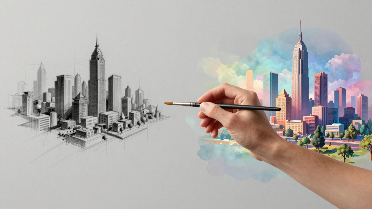
We live in an era where computer-generated imagery (CGI) dominates. Does the connection to traditional art still hold? Yes, actually, more so. Every digital animation begins as a concept sketch. Before a computer renders a creature, an artist draws it. At studios like Pixar or DreamWorks, artists often study anatomy textbooks and classical sculpture to ensure their digital characters look believable.
Even when creating fantastical cities, the team studies perspective drawings. If you look at the background of a Disney movie, the depth and layering follow the rules of atmospheric perspective taught in the sixteenth century. Distant objects are blurrier and lighter in tone. Close objects are sharp and detailed. These aren't code settings. They are artistic decisions coded into software presets.
This fusion also helps bridge the gap for viewers. When a movie mixes real actors with CGI monsters, the lighting on the monster must match the lighting on the actor. That match relies on an artist's eye for color temperature and intensity. If the lighting doesn’t match, the illusion breaks. It reminds the audience that the object is fake.
Why This Matters for Viewers
Understanding the influence of visual artists changes how you experience a movie. When you notice a shot is framed like a photograph or colored like a painting, you realize it is a constructed piece of media. You aren’t just consuming entertainment. You are witnessing a dialogue between centuries of creative thought.
It helps you appreciate the craft. Next time you see a movie with a very distinct look, ask yourself: which artist influenced this? Is it the muted tones of a Norman Rockwell portrait? Or the chaotic energy of a Jackson Pollock action painting? Recognizing these links turns watching a film into an interactive exercise. You become part of the creation process simply by spotting the references.
This awareness also prepares you for future storytelling. As virtual reality (VR) and Augmented Reality (AR) grow, the line between being "in" a painting and watching a screen vanishes. The next generation of filmmakers will likely treat three-dimensional space as a canvas in a literal way. Understanding the roots in 2D art ensures you won’t get lost when those technologies arrive fully.
Ultimately, movies are stories told through pictures. And pictures belong to painters first. Every cut, every color choice, and every shadow is an echo of the art that came before it.
Do directors actually collaborate with living painters?
Yes. While less common than in the past, directors like Wes Anderson and Guillermo del Toro frequently consult with contemporary artists for poster designs, set layouts, and prop illustrations. Some productions hire storyboard artists who are also fine painters to maintain visual consistency.
Which art movement influences horror movies the most?
German Expressionism from the early 20th century is the biggest influence. Its use of distorted shadows, angular sets, and high contrast lighting established the visual vocabulary for modern horror genres.
What is the role of a Production Designer in relation to art?
A Production Designer acts as the head architect and interior decorator of a film. They research historical art periods to ensure sets and props are accurate to the story's timeline, effectively acting as the chief artist for the visual environment.
How does color grading relate to painting?
Color grading adjusts the hues and saturation of the final footage. It functions similarly to glazing in oil painting, where layers of transparent color change the mood and depth without altering the underlying image.
Are all movies visually influenced by fine art?
Almost all movies use basic principles like lighting and composition derived from visual art. However, some directors, particularly those in avant-garde cinema, actively deconstruct these rules to create unique, sometimes jarring, visual experiences.


Comments(6)