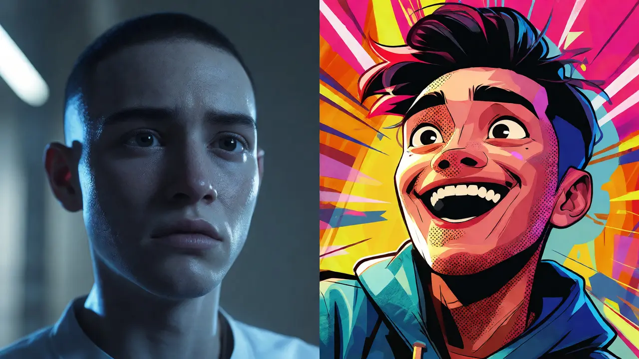
You know that feeling when you watch a movie and the characters look so real they feel dead? Like they’re wax figures moving through a high-definition vacuum? That’s the trap of photorealism. For decades, studios chased it like it was the holy grail. If it didn’t have pores, sweat, and individual strands of hair catching the light, it wasn’t "good." But here’s the thing: realism isn’t the goal. Emotion is. And often, the most powerful emotional punches come from things that don’t look real at all.
Think about Spider-Man: Into the Spider-Verse. It didn’t try to look like live-action footage. It looked like a comic book came to life. The frame rates dropped, the lines were visible, and the colors popped in ways reality never could. That choice wasn’t a limitation; it was a weapon. It allowed the audience to suspend disbelief instantly because they weren’t trying to judge if the physics were accurate. They were just feeling the story. This is the core argument for stylized animation: it prioritizes artistic expression over physical accuracy, creating a visual language that connects directly with the viewer’s imagination rather than their critical eye.
The Uncanny Valley and the Lie of Realism
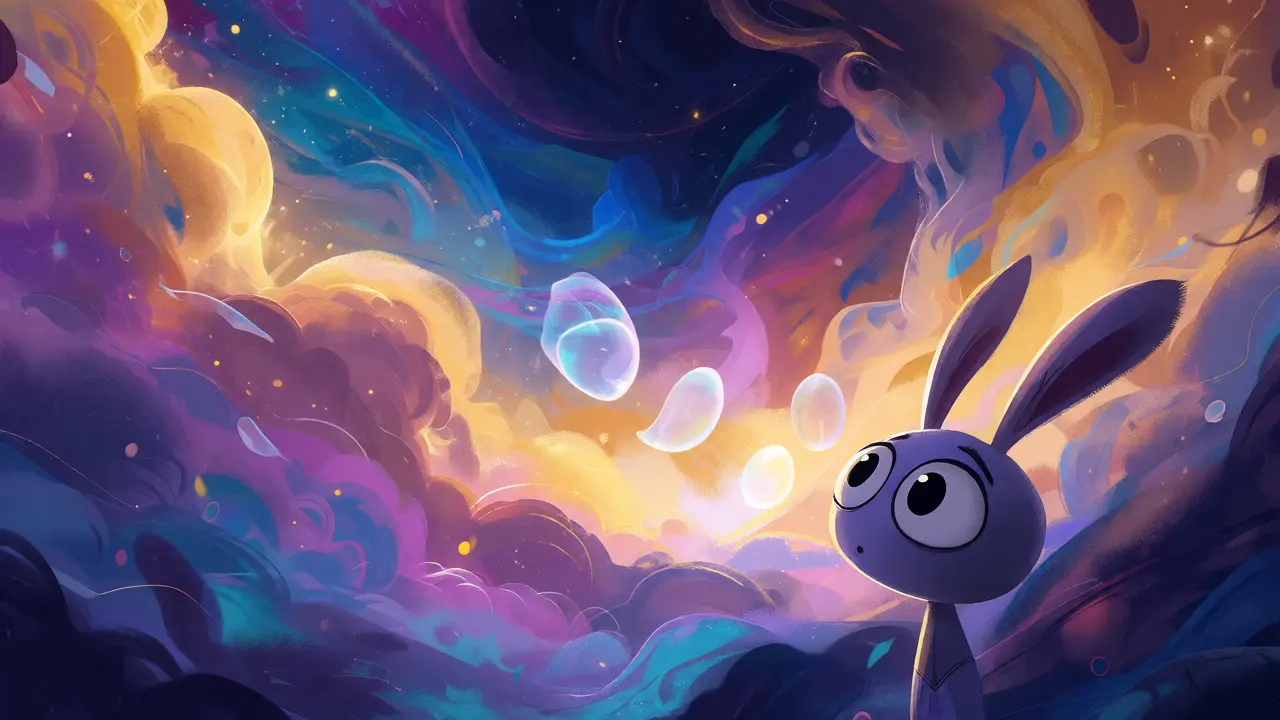
Let’s talk about why chasing perfection can backfire. There’s a concept called the Uncanny Valley, which describes the eerie feeling humans get when something looks almost human but not quite. When an animated character is 95% realistic, your brain screams "fake" because it spots the tiny errors in micro-expressions or skin texture. But when a character is 100% cartoonish-like a rabbit with big eyes or a robot made of boxes-your brain relaxes. You accept them as symbols of emotion, not flawed simulations of people.
This isn’t just theory. Look at Pixar’s evolution. In early films like Toy Story, the toys were obviously plastic. That worked. As technology improved, movies like Cars pushed toward shiny, reflective realism. But some of Pixar’s most beloved moments happen when they break that rule. In Soul, the "Great Before" isn’t a realistic place. It’s abstract, colorful, and fluid. It looks like jazz music feels. If they had rendered that sequence with realistic clouds and dirt, the spiritual weight would have vanished. Stylization allows filmmakers to visualize internal states-fear, joy, confusion-in ways photorealism simply can’t.
How Stylization Tells Better Stories
Photorealism forces you to obey physics. Gravity pulls down. Light bounces off surfaces. Water flows. These are rules. Stylized animation breaks them on purpose to serve the narrative. Take Studio Ghibli. Hayao Miyazaki doesn’t care if his wind moves realistically according to meteorological data. He cares if the wind feels like hope. In Kiki’s Delivery Service, the flight sequences aren’t aerodynamic masterclasses. They’re dreamlike. The perspective shifts, the speed changes, and the background blurs into streaks of color. This directs your attention exactly where the director wants it. You aren’t watching a simulation; you’re experiencing a memory.
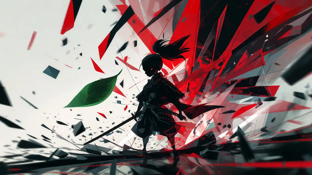
Consider the difference between a realistic explosion and a stylized one. A realistic explosion is chaotic, noisy, and hard to read visually. You might miss the hero’s reaction because you’re busy processing debris. A stylized explosion, like in Samurai Jack, uses shape, color, and timing to make sure you see the impact. The camera might zoom in on a single falling leaf while the world explodes behind it. This clarity is crucial. When every pixel is fighting for realism, storytelling gets lost in the noise. When the art is simplified, the story shines.
Technical Tricks Behind the Magic
So, how do artists actually pull this off? It’s not just about drawing weird shapes. It’s about specific technical choices that reject standard rendering pipelines. Here are a few common techniques used in modern stylized films:
- Frame Rate Manipulation: Standard film runs at 24 frames per second (fps). Most CGI animates at 24fps too, making movement smooth and floaty. But stylized films often drop to 12fps or even 6fps for certain characters. This creates a jerky, stop-motion feel that makes the character seem more handmade and tangible. The LEGO Movie did this brilliantly to mimic actual brick motion.
- Non-Photorealistic Rendering (NPR): This is the broad term for any technique that makes 3D graphics look like 2D art. Techniques include cel-shading (flat colors with black outlines), halftone dots (mimicking comic book printing), and painterly textures (brush strokes instead of smooth gradients).
- Exaggerated Proportions: Real humans have heads that are about 1/8th of their height. Cartoon characters often have heads that are 1/3rd or larger. This emphasizes facial expressions, which are key to empathy. Big eyes mean big emotions.
- Camera Movement Abstraction: Instead of simulating a handheld camera or a steady dolly, stylized films might use snap-zooms, whip-pans, or static shots that cut abruptly. These editing rhythms match the energy of the art style.
These aren’t just aesthetic choices; they are cognitive shortcuts. Your brain processes simplified images faster. By reducing visual clutter, the animator ensures you focus on the action and emotion, not the texture of a shirt.
| Feature | Photorealistic Approach | Stylized Approach |
|---|---|---|
| Primary Goal | Mimic reality accurately | Convey emotion and theme |
| Audience Focus | Checks for technical flaws | Engages with narrative flow |
| Physics Rules | Strict adherence required | Bent or broken for effect |
| Production Cost | Extremely high (compute-heavy) | Variable (can be lower or higher depending on complexity) |
| Longevity | Ages poorly as tech improves | Timeless (art style remains distinct) |
| Example Film | The Lion King (2019) | Spider-Man: Across the Spider-Verse |
Why Audiences Are Ready for Less Realism
We live in a hyper-real world. Our phones take photos that rival professional cameras. We see CGI in every superhero movie, so we’ve become desensitized to it. When everything looks perfect, nothing stands out. Stylized animation offers a refreshingly different visual diet. It feels crafted. It feels intentional.
Look at the success of Guillermo del Toro’s Pinocchio. It’s stop-motion, which is inherently less smooth than digital CGI. But that roughness added warmth. The fingerprints on the clay, the slight wobble of the joints-it reminded viewers that a human hand made this. In an age of AI-generated content and automated rendering, that human touch is valuable. Stylization signals authenticity. It says, "We made choices," whereas photorealism often says, "The computer calculated this."
Furthermore, stylization allows for cultural specificity. Japanese anime has long understood this. The way light filters through cherry blossoms in Makoto Shinkai’s films isn’t physically accurate, but it captures the melancholy of spring perfectly. Western studios are finally catching up, realizing that global audiences respond to distinct visual identities, not just generic high-definition gloss.
Common Pitfalls in Stylized Design
Just because you’re going stylized doesn’t mean anything goes. Bad stylization is worse than bad realism. Here’s what to avoid:
- Inconsistency: If your world is flat and 2D, don’t suddenly render a hyper-realistic cup of coffee. Pick a rule and stick to it, or break it deliberately for contrast.
- Over-complication: Stylization should simplify, not complicate. Adding ten layers of brushstroke textures to a simple character can confuse the viewer. Keep the silhouette clear.
- Ignoring Lighting Logic: Even if the colors are unrealistic, the lighting must follow consistent rules within that style. If the sun is yellow, shadows shouldn’t be neon green unless there’s a magical reason. Internal consistency maintains immersion.
The best stylized films feel like a cohesive dream. Every element-from the character design to the background matte paintings-speaks the same visual language. When that harmony breaks, the illusion shatters.
Frequently Asked Questions
Is stylized animation cheaper than photorealistic animation?
Not necessarily. While it avoids the massive computational cost of simulating millions of hairs or realistic water physics, stylized animation often requires intense manual artistry. Artists may need to hand-tune shading, line weights, and frame rates for every shot to ensure the style holds up. However, it can be more budget-friendly for smaller studios because it relies less on expensive hardware and more on creative talent.
Why do some people prefer photorealism despite its flaws?
Some viewers equate realism with quality or prestige. They want to see technical mastery and believe that if it looks real, it’s impressive. Additionally, genres like horror or historical drama often benefit from grounding the supernatural or past in familiar visuals, making the stakes feel immediate and tangible.
Can video games also use stylized animation effectively?
Absolutely. Games like Zelda: Breath of the Wild or Hades use stylized graphics to maintain performance stability and create a unique brand identity. Stylization helps games run smoothly on various hardware while providing a distinctive look that ages better than realistic graphics, which often look dated within a few years.
What is Non-Photorealistic Rendering (NPR)?
NPR is a category of computer graphics techniques designed to make 3D models look like 2D art forms such as paintings, sketches, or cartoons. Unlike traditional rendering, which aims for photo-realism, NPR focuses on artistic interpretation, using algorithms to simulate brush strokes, ink lines, or color palettes.
Does stylized animation limit storytelling?
On the contrary, it expands it. Photorealism ties stories to physical laws. Stylization frees creators to visualize abstract concepts, memories, dreams, and emotions literally. It allows for surreal transitions and symbolic imagery that would look jarring or impossible in a realistic setting.